Colors / Ivory
Mouth-watering silence
Frances Stark
“Colors” is a column in which a writer responds to a specific color assigned by the editors of Cabinet.
There’s an eight- or ten-foot telephone cord coming out of my laptop and curling into a heap on my beige melamine desktop; it has to travel an awkward distance in order to plug into the phone jack. I noticed when taking the recently-purchased cord out of its packaging that it was designated “ivory.” It doesn’t look ivory to me. I mean, I guess it’s ivory the way so many neutral housewares are labeled “ivory,” but it’s not the ivory I have in mind. I want to make a monochrome painting here. I imagined my “Ivory” text as a cross between a do-it-yourself Robert Ryman painting (I hear kits are available in museum shops) and a Morandi composition of mostly off-white objects.
The cord is not plugged into the phone jack, but there are two things I previously culled from the Internet that I’d like to get out on the table now and be done with, because I want this to be a real monochrome and not some kind of calico juggling act of disparate references like I’m used to performing.
The first snippet isn’t something I went fishing for. It just arrived by email in my virtual copy of the New York Times. It’s an art review by Roberta Smith about an exhibition of ivory at the Metropolitan Museum of Art. Living in California, I instantly felt that this was a big deal that I was missing out on, and how on earth could I address Ivory for a New York–based publication and ignore the fact that this exhibition was taking place? If only I could see it, it might make a significant difference, or even blow my mind, but let’s not get carried away. This’ll do:
The flowering of ivory carving
in the monasteries of the Middle Ages, equaled only by manuscript
illumination, did not coincide by chance with the Crusades. Meanwhile,
the number of elephants required to keep nineteenth-century Europe
outfitted in billiard balls and piano-keys alone would make even the
most unrepentant carnivores among us weep.
I also
underlined the phrase “pure, useless delight”—a direction I’d prefer
to head in, but before that, the other Internet finding has to do with
several half-assed websites attributing the origin of the phrase “ivory
tower” to a passage in the Bible where Solomon says about his beloved,
“Thy neck is as a tower of ivory.” It strikes me as utterly lame. Go in
search of the root of a culturally complex pejorative and you find some
empty biblical cheese; only later did I dig deeper to find that the
writer Sainte-Beuve may have plucked it from the Bible and coined the
term to criticize aesthetes like Nerval and Baudelaire. It still
doesn’t explain why the tower is ivory. But here’s another clipping for
you:
In 1851, when Louis Napoleon—whom the bourgeoisie had managed to install as president—dissolved the Second Republic in a coup d’état and established the Second Empire in its place, Baudelaire’s former companions in Bohemia soured on politics once and for all. Withdrawing into what Sainte-Beuve derided as the “ivory tower” of a life devoted solely to art, writers like Flaubert and Nerval declared war on bourgeois society; this was the beginning of what Lionel Trilling eventually described as the self-perpetuating “adversary culture.” But Baudelaire, who no longer viewed the world as being divided between bourgeois and Bohemian, but between bourgeois and Bohemian on the one hand, and true philosopher-artists on the other, would have no part of it. Trapped, if you will, between the “abyss” of Gautier’s aesthetic separatism and the inauthentic “solid ground” of bourgeois vulgarity and do-gooder mediocrity, Baudelaire was a man forever on the verge.
Oh, did I say I wanted to make a monochrome painting here? I’m starting to think it’s totally impossible. I make actual paintings too, but nobody really considers me a painter. Right now I’m working on some paintings and it’s in that painting part of the painting that I want to be, rather than here with this clatter of associations and references. I don’t think it would be stretching it to say my paintings are ivory in color. The surface of these paintings has been the only clear idea in my head when it comes to pondering the color ivory. All the baggage of ivory the material is just more noise having to do with colonialism and all kinds of social problems and guilt that doesn’t interest me. And the baggage of ivory the tower? More interesting, sure, but too much clutter overrides the color.
Nobody really considers me a painter. In fact, I just recently applied for a tenure-track teaching job that falls under the heading Painting, and when I mentioned that to one of my former teachers, who is a painter known for his writing more than his painting, he said, “You applied for the Painting position? That’s a long shot.” This was followed by a little evil laugh as he punctuated our conversation by walking away. I may not be enjoying the view from the ivory tower any time soon.
The ivory-colored paintings I’m making have that hint of yellowish warmth that the phone cord does not, and a hint of surface malleability that the plastic of the cord does not. For reference, I uncovered an ivory-handled tool from the early twentieth century. It’s not clear if it came from grandma’s vanity or grandpa’s workshed, but regardless, it’s my only actual ivory referent in the house. The ivory part is well-handled on account of it being, well, a handle, and so it’s well-worn and has some cracks that are quite dark with dirt, and some very yellowy grains. It’s the porousness of the ivory that allows for the yellow, I think, or that’s at least what happens when I’m painting. I apply the milk paint—casein—and then sand it, and in order to feel if it’s smooth, I rub my hands across it and then the oil from my hands gets in there and it starts to get slightly buffed and ever so slightly yellowish here and there, and I’m sure you want to keep your finger-oils out of paintings, but I can’t resist. Strictly speaking, ivory has been assigned to me—not something I can hide from you, or myself. But the thing is, I have an aesthetic weakness for ivory-colored things and somewhere along the line I suprised myself by wondering if it wasn’t too close to my aesthetic to be written about responsibly, as if I’m not allowed to have a personal aesthetic. Now, I wonder where I ever picked up an idea like that? I don’t like the way such a vague notion like writing responsibly can just pop up out of nowhere completely unwarrented and sully the mood with do-gooderisms and mediocrity. It’s as irrelevant as Solomon’s “thy neck is as a tower of ivory” is to the state of seclusion or separation from the ordinary world and the harsh realities of life.
I probably should retreat to the Ivory Tower, but I don’t think the view is that great. Surely I’d have less time to lie around the house looking at and thinking about my stuff. This includes, of course, my ivory-colored things and the less yellowish and more simply off-whitish stuff too, like my paintings and the German porcelain and my collection of ivory-colored skirts that I never wear, or the broad, beautiful margins of Franny and Zooey, or all the bowls and candlestick-holders and my Commes des Garçons wallet and my chrysanthemum brooch made out of sharks’ teeth. This rag-tag list is not exactly how I pictured my Ivory Morandi. I told myself early on it should be a perfect crowd of individual articulations; matching, of course, but not so closely matching as to appear to be wearing uniforms. I thought I was so clever; “not so closely matching as to appear to be wearing uniforms.” Needless to say, I didn’t get close to meticulously depicting a series of things, let alone their subtle variations. That’s not easy to do in writing, on account of how easy it is to stray from the purely visual. I guess that’s why I didn’t actually pull together an arrangement of vases and fabrics, because the translation would be too grueling. I wish my computer screen was ivory-colored, instead of this blue-white. And while I’m off-centered, I might as well mention that I can’t stand the smell of Ivory soap, and I don’t know how they can get away with calling it “99% pure” when it has such a strong smell. But back to the paintings.
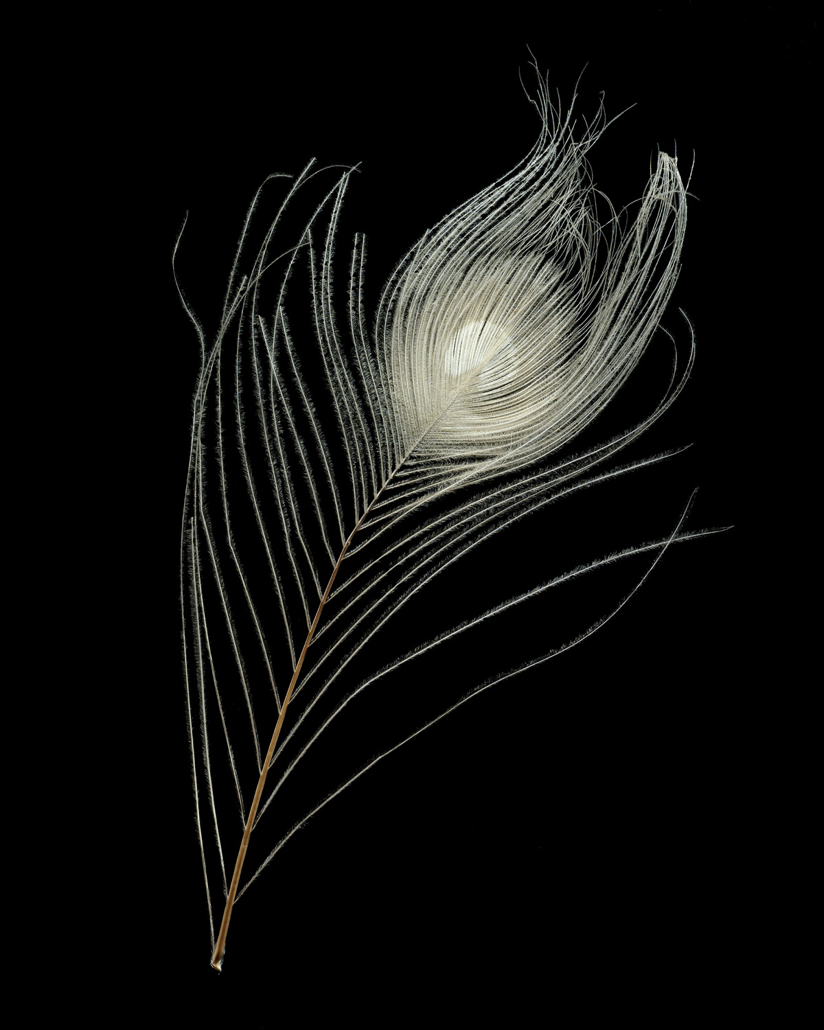
There were some problems with the casein surfaces my assistant was working on, and it wasn’t her fault but mine. It turned out that they had to be totally redone, so I took the opportunity to paint them myself this time. I got to enter into that pure ivory space for a couple of days, and it was a relief in a sense, but not as perfect as I had imagined it. Trying to sand something to perfection and get that hint of yellow and a hint of gloss is a lot less entrancing than I remember it being. It’s like a form of futile dermabrasion. As I sanded, I wondered if I would ever break down and resurface my face with dermabrasion. And then I wondered if the porousness and the small blemishes on my panels weren’t in fact a feature that made the surface more beautiful. I know that sounds corny; it reminds me of my mother explaining why it’s okay if my skin isn’t like ivory. Look at the golden hills, she would say, see how they look like soft lion paws and you want to pet them, but you know full well that if you go up in those hills they are patchy and scratchy and not soft to the touch at all. Okay, now this is getting too yellow. Let it be known I don’t have experience with monochroming. My ivory paintings are ivory now, but I plan to break their current mouth-watering silence with imagery. Peacocks.
Frances Stark is an artist and writer based in Los Angeles.