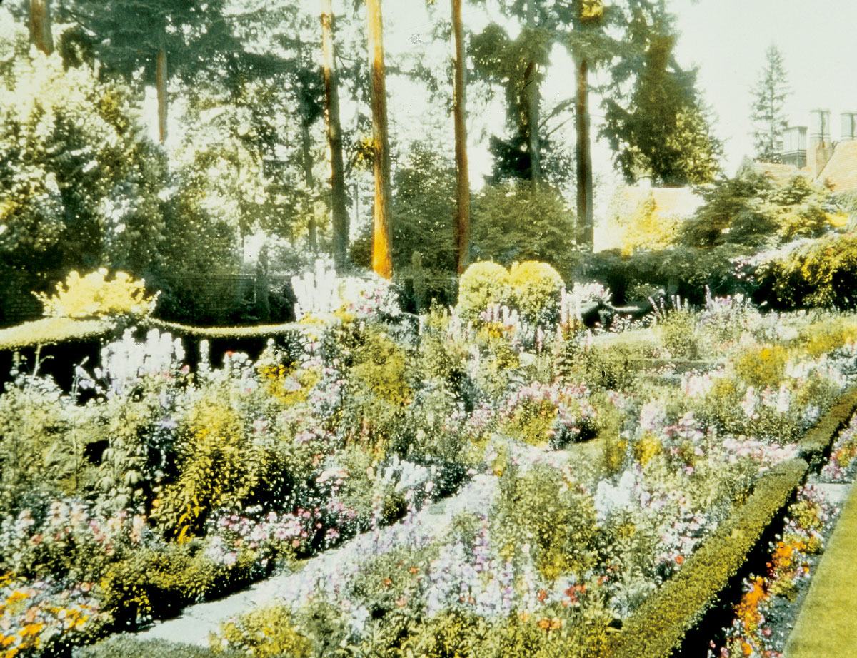
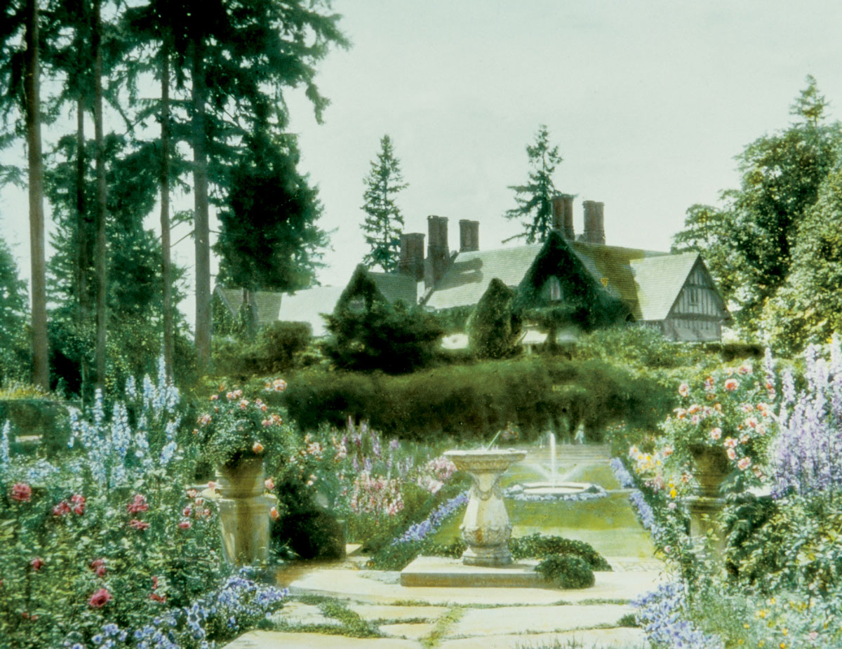
For almost 20 years, American authorities on garden design described the walled, sunken garden on the Thornewood estate near Tacoma, Washington, as one of the most beautiful gardens in the United States and England. Photographs of the garden were featured in Beautiful Gardens in America (1915), American Country Houses of To-Day (1915), and House Beautiful (1926), but these black-and-white images captured only one aspect of the garden’s success: its layout. Although the most unusual feature of the Thornewood sunken garden was its magnificent view of Mount Tacoma (now known as Mount Rainier), this effect was magnified and complemented by plantings that exemplified the technique known as “color gardening.”
It was English garden designer Gertrude Jekyll (rhymes with treacle) who inspired Americans to build color gardens. The English color garden abandoned the purely “formal” style of geometrical patterns or rows of unmixed flower varieties in color blocks. Instead, the new and comparatively “naturalistic” color garden was usually composed of a formal rectangular space with a central aisle of lawn flanked by long flowerbed borders. These beds mixed bulbs, herbaceous perennials, and annuals in drifts, Jekyll’s term for elongated planting areas with softly defined edges. While such mixed beds were termed informal, their planting schemes were scientifically formulated to create color-determined optical effects.
In the typical Jekyll-influenced flower border, complementary colors succeeded each other in tonal progressions. Cool tones of blue and lilac with pale yellow and white highlights graduated to warmer yellows, oranges, and reds, before climaxing in scarlet. The colors then receded through the same spectrum to finish in the cooler, paler tints. This compositional principle was a three-dimensional rendering of the color schemes that Jekyll admired in the work of British landscape painter J.M.W. Turner. Following Turner, Jekyll adopted red as the color of matter, yellow as light, and blue as distance when she formulated her garden borders as pictures to be seen in totality, as unified compositions. Jekyll’s use of complementary colors within each grouping of the overall succession was built on a scientific understanding of visual experience as dynamic. When an eye becomes saturated with one color, it seeks that color’s opposite, which in turn takes on a greater intensity. Color-themed gardens composed of analogous hues were similarly enhanced by minute touches of complementary color, like flashes of yellow within a predominantly purple border.
When members of the posh and almost exclusively female Garden Club of America (GCA), many of who spent enormous sums of money on their fashionable color gardens, visited Thornewood in July 1930, a visitor responded in awe: “At last we have seen Sutton’s catalogue come to life!”[1] At the time, Sutton & Sons, Ltd., was the Rolls Royce of British seed houses. The visitor’s reference to Sutton’s was twofold in meaning. Literally, Thornewood’s combination of blue Heliophilia and orange Ursinia anethoides was advertised in the 1930 Sutton’s catalogue. This pairing also exemplified the color gardener’s ideal so often featured in that catalogue: complementary colors that stimulated and satisfied the eyes.
Bringing a catalogue like Sutton’s to life was a rare occurrence in the early days of trichromatic halftone photographic prints. Color gardening only works with a subtle interplay of contrasting and complementary colors, which designers planned out in extreme detail. A careful orchestration of seasonal effects was only possible when horticultural dealers and customers agreed on color nomenclature. Otherwise, recounted one member of the GCA, “One reads glowing and poetic accounts, studies pictures of large, gay and vigorous specialties, and passes from a hopeful spring to a disillusioned summer.”[2] A common complaint among mail-order seed purchasers was that catalogue printers couldn’t guarantee images that were true to color, and that their verbal descriptions were vague, mysterious, or even misleading. In the horticulture trade, it was customary, even if not strictly ethical, to invent new color names to hype the introduction of newly-hybridized or imported flowers.
Jekyll herself criticized Sutton’s for its use of “complementary euphemisms”: “Thus, if I want a Giant comet [a variety of Aster] of that beautiful pale silvery lavender … I have to ask for ‘azure blue.’ … If I want a strong, rich, violet-purple, I must beware of asking for purple, for I shall get a terrible magenta such as one year spoilt the whole colour scheme of my Aster garden.”[3] Although horticulturists had innovatively experimented with color catalogues since the early 19th century, consumers rarely complained about color inconsistency until the rise of color gardening.
When the GCA incorporated in 1913, members immediately formed a Color Chart Committee. For the next 20 years, the committee was powered mainly by the efforts of landscape architect Fletcher Steele and prolific garden writer Louise Yeomans King. Steele was a landscape architect known for his innovative sculptural use of form and color. For years, Steele devoted time to registering the colors of named flowers, recording for each its values in both sun and shade.
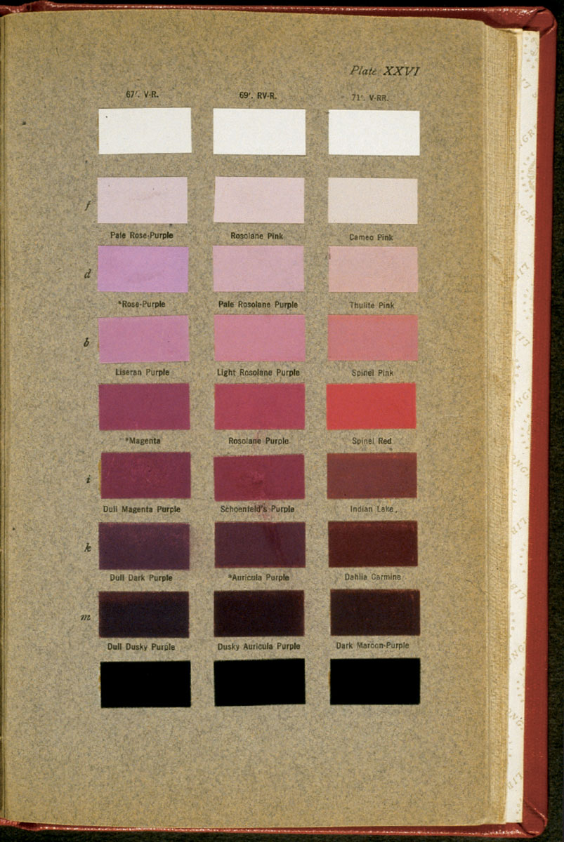
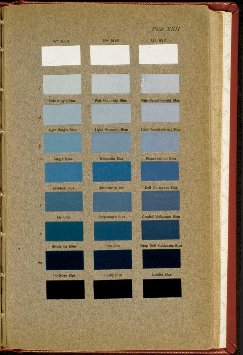
When the GCA Color Chart Committee first formed, there were several color charts in use by horticulturists and naturalists, not to mention others created by and for painters, cloth dyers, and other trades. Most color charts were physically unwieldy, cost-prohibitive, hard to acquire, and often difficult for the non-scientist to interpret. The two charts most popular among horticulturists were the Répertoire de Couleurs, formulated by the French Chrysanthemum Society on the system created by chemist Michel Eugène Chevreul during his tenure as director of dye works at the Gobelin textile factory, and the Color Standards and Color Nomenclature, created by the American ornithologist Robert Ridgway. The GCA preferred Ridgway’s Color Standards for practical reasons: it was an easily handled, bound volume of swatches painted with aniline dyes. These coal-tar dyes, compared to the oil-based chromolithographs of the Répertoire de Couleurs, provided consistent pigmentation from volume to volume and were more resistant to fading from sun exposure. Ridgway used a combination of numerical and verbal descriptions, some of which, like “Forget-me-not Blue,” were oddly self-referential. Ridgway conscientiously explained to readers that he first selected colors, and then assigned descriptive, as opposed to definitive, names: “Leaf Green” identified a shade of green, not the shade of all leaves. Color nomenclature had proven an unstable referent, so Ridgway placed authority in his chart’s physical stability. With the Ridgway chart in one hand and a garden catalogue in the other, garden club members ordered plants in larger numbers with a greater sense of control. A perfectly color-coded garden, a “Sutton’s come to life,” was finally an attainable goal.
During this same period, professional horticultural organizations and trade journals only occasionally discussed the question of color nomenclature. When they did, it was usually in the context of improvements in catalogue printing technology, or in tandem with the more active debates over Latin and common plant names. In 1938, the Royal Horticultural Society collaborated with the British Colour Council to produce a Horticultural Colour Chart; it was destined to become the favored chart for horticulturists, but at the time, few professionals other than Fletcher Steele even acknowledged the significance of the new chart. The only two articles on color in that year’s Florists Exchange and Horticultural Trade World failed to mention it. Instead, one of those articles satirized consumers’ concerns in a depiction of women gardeners arguing over whether the color of certain sweet peas were scarlet, crimson, or carmine.
Without reliable and durable broad-spectrum color photography, the challenge of recording color gardens was met, with moderate success, by hand-tinting photographic prints and transparencies. During the 1920s and 1930s, garden club members individually and collectively hired professional photographers and colorists to produce hand-tinted glass lantern slides that were shipped around the country for garden club presentations. Lantern slides from this period were made of a black-and-white film emulsion positive sandwiched between two glass plates. A “colorist” used tiny brushes to apply transparent oil paints directly to the top piece of glass. The fragile three-by-four-inch slides were then projected and enlarged by a lantern illuminated by a kerosene lamp, carbon arc lighting, or other light source. It is the projection, not the physical slide that was the intended artistic product.
These layered images exist on a precarious border between mechanical documentation and manual artistry. While some colorists were clearly either knowledgeable about plant materials or working from notes taken on site by the photographer or gardener, the images themselves show that other colorists were either uninformed or uninterested in botanical accuracy. Because the slides were made in multiples to be sent out on the GCA lecture circuit, curious inventions like purple hostas show up in an Edward Van Altena slide of the Shirley Plantation garden in Virginia, while the slide’s fraternal twin remains within the realm of known vegetation.
When Asahel Curtis’s studio produced two versions of the same black-and-white photograph of the Thornewood color garden taken in the mid-1930s, one of the lantern slide positives was painted with much greater precision. In the sloppier version, the flower baskets on top of the wall posts are painted light green, while on the tighter version there is a careful application of red flowers, indicating the potted geraniums that visitors’ reports document as pink. Lining the borders of the flower beds is a row of pansies that are painted with a single stripe of orange paint in the imprecise slide, while in its double, the pansies are colored with spots of lavender that are not only more carefully delineated, but also more likely to be accurate to the garden’s color scheme. The hand-coloring in a similar view produced by Reginald Malby’s studio is a far more detailed and realistic representation than either of the Curtis images. Malby’s blue, lavender, white, and rose tints actually conform to plant lists and visitors’ descriptions.
The GCA’s efforts to overcome the mechanical difficulties of producing color images for color garden planning and documentation were, in the end, only moderately successful. Even Malby, careful as he may have been in painting his lantern slide of the Thornewood color garden, also strayed from representational accuracy. Look closely at the garden’s far wall: under the paint are four seated women, perhaps members of the Garden Club of America, rendered permanently green.
The author wishes to acknowledge Paula Healy and Walter Howell of the Smithsonian Institution’s Horticulture Services Division for assistance in the preparation of this article.
Robin Veder is a cultural historian in San Jose, California, and curator of the currently touring Smithsonian Institution exhibit “Exploring Garden Transformations, 1900–2000.”