Colors / Pink
Not so sweet after all
David Byrne
“Colors” is a column in which a writer responds to a specific color assigned by the editors of Cabinet.
“I adore that pink! It’s the navy blue of India,” declared Diana Vreeland, former editor of Vogue and source of many aphorisms. By this she meant that, just as navy blue in our culture tends to signify conservative respectability, pink exemplifies tradition and balance in India. The existence of universal stylistic and psychological color reactions is therefore placed in doubt: what we would consider a wild, flamboyant, and feminine color is, in India—at least according to DV—considered refined and conventional.
I asked my daughter, who is thirteen and loves the color pink, why the attraction and what it’s all about. She said it’s a “nice color,” it “looks good on me,” and “guys can’t wear pink—it makes them look stupid” (more on this later). “Pink and black look good on everybody—except redheads.” When pressed, she suggested, “Maybe it’s because of Barbie” (proof that kids are aware of the effects of marketing, branding, and advertising). “Maybe because I was given pink stuff as a baby—and maybe because it’s pretty.”
According to a Japanese color analysis website, “the color pink is very suitable for ladies. In this my research, I would like to say that they want to have dream, hope toward their future and to be tender in mind.”
These expert sources were consulted because I originally thought, when asked to write about this color for Cabinet, that I would investigate the assumed female propensity for pink. I wondered, was there indeed such a link? And if so, why and how? In addition to consulting fashion mavens, online analysts, and teenagers, I planned to ask sociobiologists why this association, if it indeed existed, might be beneficial to the species.
As I soon found out, however, pink was actually considered a color best suited to boys until as late as the 1950s. Blue was the girlie color. Pink, inasmuch as it is a watered-down red—the fiercest of colors (does anyone doubt me here?)—was naturally associated with boys, with their instinctive attraction to fire trucks and sports cars. The Ladies’ Home Journal in 1918 said, “The generally accepted rule is pink for the boy and blue for the girl. The reason is that pink, being a more decided and stronger color, is more suitable for the boy, while blue, which is more delicate and dainty, is pertier [sic] for the girl.”
So much for genetic, gender-based color predilections—or at least in the way we commonly think of them. My research would now take me in a new direction. Why did the gender/color switch take place? It’s hard to say for sure, but one could make the case that as women asserted themselves in society in the late 1940s, as a response to the influx of men who were mostly traumatized and battered from World War II, more active roles in the world encouraged women to adopt an appropriately energizing color for themselves—that is, if one is to believe the Ladies’ Home Journal color analysis. It could thus be argued that adopting pink was an early sign of the feminism due to flower in the 1960s, and that far from being a color imposed on women by marketing men, pink was actually a badge of self-determination and power. Alternatively, one might conjecture that the pink triangles used during the war by the Nazis to identify homosexuals gave the color a “queer” association, at least to North Americans, thus leading men to abandon it.
Some hard data on the “pink effect” is available. In the late sixties, Alexander Schauss, director of Life Sciences at the American Institute for Biosocial Research in Tacoma, did extensive studies on psychological and physiological responses to the color. Schauss had read the earlier studies of Swiss psychiatrist Max Luscher, who found that color preferences provide useful data about one’s personality profile. He noticed that color preferences shifted according to psychological and physiological fluctuations in his patients. Color choice reflects emotional states, according to Luscher, and also reflects corresponding changes in the endocrine (hormonal) system.
Schauss then asked himself if the reverse might also be true. Could color cause emotional and hormonal changes? Could varying wavelengths of light, received by the eye, trigger profound and measurable responses in the endocrine system?
In early tests in 1978, Schauss observed that color, surprisingly, affected muscle strength, invigorating or enervating the subject, and it even influenced the cardiovascular system. Schauss began to experiment on himself, with the help of fellow researcher John Ott, and soon discovered that a particular shade of pink had a most profound effect. He labeled it P-618. It was noted that by merely staring at an 18 x 24 inch card printed with this color, especially after active and intentional exercise, there would result “a marked effect on lowering the heart rate, pulse and respiration as compared to other colors.”
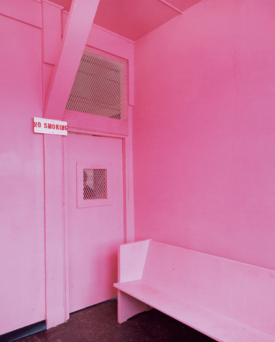
In 1979, Schauss managed to convince the directors of a Naval correctional institute in Washington State to paint some prison confinement cells pink in order to determine the effects this might have on prisoners. Needless to say, suggesting that prison cells be painted pink was not an immediately popular idea—prison officials, like the rest of the culture, having rapidly absorbed the switch in pink’s gender affiliation—so, to commemorate the bravery of the prison directors, Schauss named the color after the two men. Baker-Miller Pink is now the official name of the paint that can be mixed as follows: R:255, G:145, B: 175.
At the correctional facility, the rates of assault before and after pink exposure were carefully monitored. According to the Navy’s report, “Since the initiation of this procedure on 1 March 1979, there have been no incidents of erratic or hostile behavior during the initial phase of confinement” (emphasis mine). Merely fifteen minutes of exposure was enough to ensure that the potential for violent or aggressive behavior had been reduced. That’s not long. Pink is strong medicine! The confinement cells are pink to this day, and thus far, no hostile or violent behavior has occurred. In spite of such success, military use of Baker-Miller Pink has been limited, though its enervating effect on potential and real enemies has indeed been investigated. A number of tanks used in Desert Storm were pink, but attempts by antiwar activists to surreptitiously surround the Bush administration with P-618 have thus far been unsuccessful.
Subsequently, Baker-Miller Pink was studied by a team at Johns Hopkins University, where a peculiar tendency toward appetite suppression was observed. Researchers confirmed the now-familiar stress-reduction effects, but the corresponding appetite reduction was an unexpected side effect—fortuitous, as this team also happened to be searching for alternative means of weight loss.
The Santa Clara county jail soon got word of P-618, sometimes also called “Drunk-Tank Pink,” and in late 1979, in a rush to achieve results, they may have overreacted. Officials painted a holding cell pink and immediately placed several inmates there for a few hours—this resulted in the prisoners scratching the paint off the walls with their fingernails. Subsequent procedures were limited to the recommended fifteen minutes. The color was also used at a California VA psychiatric hospital and a San Bernadino youth clinic. One implacable patient, whose behavior seemed to show no signs of improvement under normal conditions, was as a last resort placed in a pink seclusion room where “within six minutes he calmed, was heard crying, and was seen sitting in the middle of the room.”
News of the color that saps your energy continued to spread rapidly. In the early 1980s, visiting-team football locker rooms at Iowa and Colorado State were painted pink until, in an effort to control this sneaky, unsolicited color therapy, a rule was passed by the Western Athletic Conference that both visiting and home teams’ locker rooms had to be painted the same color. Color became a controlled substance. On the T.V. show That’s Incredible! when contestants were asked to support weight on their outstretched arms, those exposed to pink cards were less able to do so. And the logo of Weight Watchers, though not officially Baker-Miller Pink, is pink nonetheless, as if the appetite-suppressant properties of pink could insinuate themselves just by looking at a product’s packaging.
So, back to the beginning. Girls and Boys. Far from enhancing virility and voraciousness, pink leaches it away. Was pink then marketed, post–World War II, by men to women as a girlie color in a secret effort to restrict gains made by women in the workforce during the war? To turn the newly independent earners back into passive consumers? This was all decades before the Baker-Miller research, of course, but one might go so far as to assume that the “pink effect” was unconsciously or instinctively known (except by the writers of the Ladies’ Home Journal). Diana Vreeland’s awareness that pink’s power is culturally determined in this light looks prescient, and my daughter may buy into pink, but clearly she knows that it is being sold to her. Instinct and intuition often predate proof.
Note
One sentence of this article contains facts that are fictional. All others are verified.
David Byrne is a musician and artist who lives in New York. His most recent projects include a book and DVD entitled Envisioning Emotional Epistemological Information and a mostly instrumental record called Lead Us Not Into Temptation.
Spotted an error? Email us at corrections at cabinetmagazine dot org.
If you’ve enjoyed the free articles that we offer on our site, please consider subscribing to our nonprofit magazine, which includes unlimited access to all our archives.