Colors / Pistachio
What Nabokov saw when he heard the letter t
Spencer Finch
“Colors” is a column in which a writer responds to a specific color assigned by the editors of Cabinet.
My friends described the color as pistachio, but they were mistaken. These were art students and they should have known better. It wasn’t pistachio at all; in fact, you would need to mix a handful of pistachios in a blender with two scoops of vanilla ice cream and a tablespoon of lemon zest to even approach the color. It was my first car and, at least chromatically speaking, my best. Volvo produced this color for only two years, 1976 and 1977. If you know anything about Volvos of this era, you know about the engine, the famous B21R, which was introduced in 1975 and could propel a vehicle twice the size of mine straight up the side of a fjord. To this day I can recognize the sound of that engine from down the block, strong and smooth, low and rumbly. But the color you would probably remember, too. It was a great era for car paint: Volvo also produced a fruity orange and a robin’s egg blue in the mid-1970s. Other European car makers followed suit, a nod perhaps to a groovy 1970s Scandinavian sensibility, but the others did it with considerably less élan. Mercedes’s version of light green, for example, could only be described as bilious.
I inherited the car in 1986 and my first task was to attack the rust problem, which was getting out of hand. Ten years later, the rust would metastasize to the brake system and nearly kill me and my two Swedish passengers. But, for the moment, it was a superficial problem that could be treated with sandpaper, fiberglass filler, rust-killer, and paint. I didn’t know the first thing about painting a car, but I rented a compressor and spray gun, went to the local NAPA, and got paint mixed. The color, which had a number that I cannot remember, also had a name: Teton Green. This phrase is an etymological carnival unto itself, but really means nothing, and is in fact further from the truth than “pistachio.” I repainted the car in my parents’ garage, and after that the left side (which I painted first) was matte and the right side (which I painted after I got the hang of spraying lacquer) was nice and glossy. The hood and the roof were left original and faded a bit, and became yellower over time. A few years later I smashed the front right fender into a hardware store sign and that was repaired and repainted professionally and was somewhat bluer than the rest of the vehicle. Plus, it had a dark green pinstripe, which contrasted badly with the pistachio (although this car never looked better than it did parked under a blue spruce tree.) So it was this mix of green shades and tones, some yellower, some bluer, in various stages of fading, that was labeled “pistachio” by people who were paying many thousands of dollars a year to learn the difference between yellow and blue.
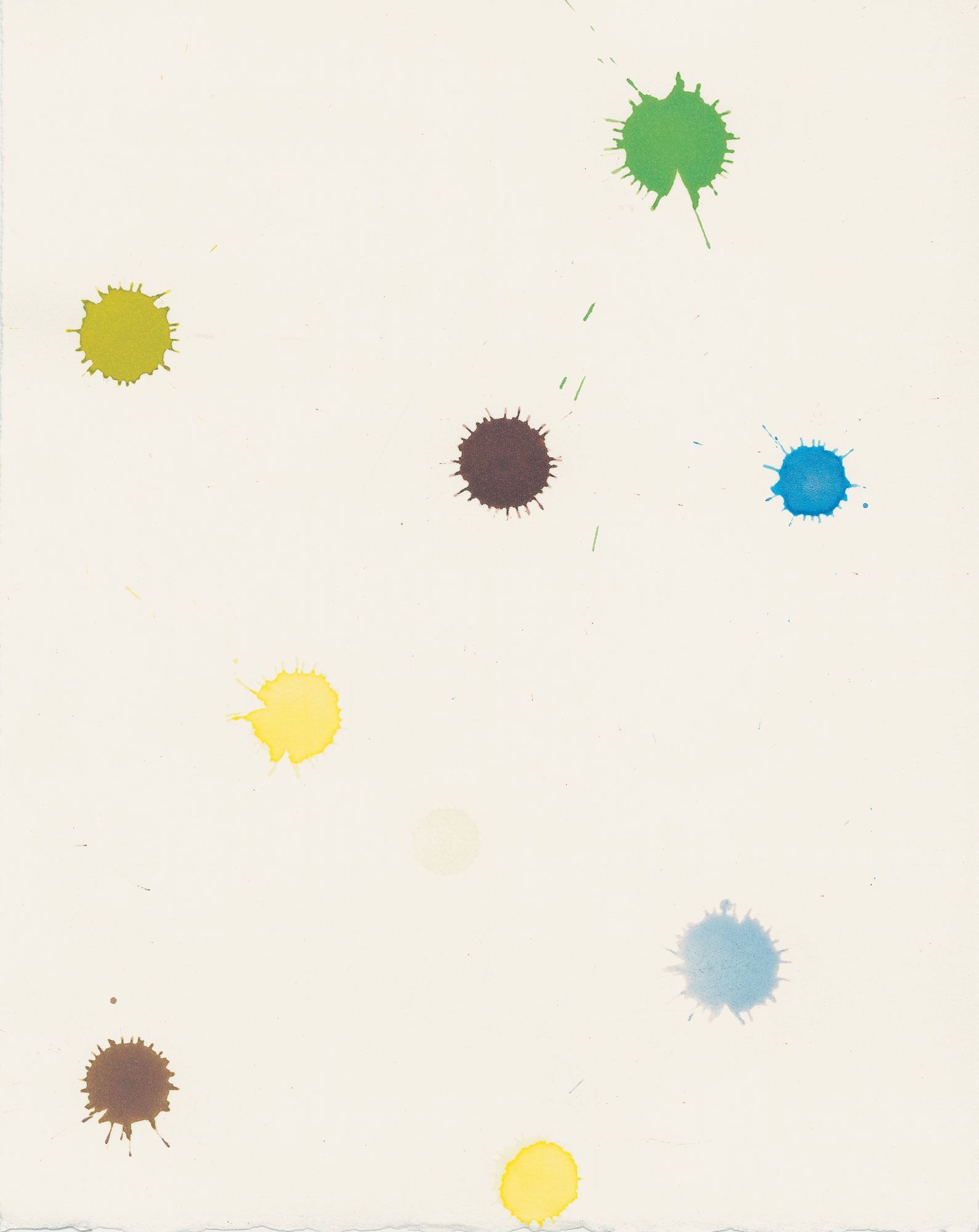
The apparent indeterminacy of pistachio as a color concept resurfaced recently when I became interested in Vladimir Nabokov’s theory of a colored alphabet. In Speak, Memory, Nabokov describes in amusing detail his “colored hearing.” It is not synesthesia, per se, but something similar. The connection for Nabokov is between the sound of the letter and a color; thus, the system varies from language to language. The a in English is weathered wood, whereas the French a is polished ebony. Nabokov points out that the rainbow spectrum in his own private language would be written as kzspygv. He does this by replacing the standard violet/indigo/blue/green/yellow/orange/red with his own huckleberry/thundercloud/azure and mother-of-pearl/unripe apple/bright-golden/rich rubber/rose quartz. He eventually took this theory to a crackpot extreme, arguing that his son‘s colored hearing represented a perfect synthesis of his own colored hearing and that of his wife, Véra. Dimitri apparently heard a lot of muddy brown.
Nabokov’s descriptions at first seem remarkably precise: for example, f is the color of an alder leaf and m is a “fold in pink flannel.” When I sat down to generate these colors with ink and watercolor, however, I discovered that they were frustratingly inexact; quite literary and quite unscientific, and not really informed by a painter’s or colorist’s vocabulary. What color, really, is a “limp noodle”? And no rainbow I have ever seen contains “rich rubber,” which Nabokov himself places in the “brown group.” Rose quartz (v) alone among the twenty-six colors is a verifiable pigment.
For Nabokov, the color pistachio is associated with the letter t. So, in the course of my research I looked at a lot of pistachio nuts, which I suspected might look different now than they did in 1966. The pistachios Nabokov ate were likely imported from the Middle East, because before 1976 the United States had virtually no domestic pistachio industry, and most nuts were imported from Iran, Iraq, and Turkey. In retaliation for the OPEC oil embargo, the United States imposed a tariff on nuts and, as a result, domestic production of pistachios exploded, mostly in California. The imported nuts are basically the same as the domestic nuts, but there is a crucial chromatic difference. The imported nuts came in shells that had been dyed red, a practice that began in the 1930s. They were dyed, apparently, to cover up ugly blemishes caused during mechanized harvesting and processing. Eventually, many consumers assumed that this red was natural. After all, the red shells look no more artificial than the bright green nuts. California producers followed suit for a while, but when red dye was identified as a health hazard a number of years ago, the natural tan shell color was phased back in. Now the old-fashioned merry Christmas nuts are rarely seen, although I did spot them in a vending machine at a bus station in Saratoga this summer. The shell color matters, because the green nut indeed looks noticeably more intense when contrasted against a red shell, as Johannes Itten points out in plate 105 of the Art of Color.
So faced with the compounded uncertainty of shell color and Nabokov’s loosey-goosey approach to color description, I sat down with a bag of pistachios to approach the color of t. There is no question in my mind that he would locate t between p and y in his rainbow, that is, between yellow and green. Pistachio nuts have an unnatural yellow acidic cast as well as a dark olive undertone, sometimes approaching, believe it or not, chartreuse. They are also more yellow at the center. (Darker green nuts, however, are supposedly higher quality.) So I knew I was somewhere between ”unripe apple” and “bright golden,” but beyond that, I was flying blind. Pistachio is really not close to any paint color that comes in a tube. You can start with Hooker’s green or even viridian, but you have to take it a long way, tarting it up with something fresh like sap green and some yellow, like acrid bismuth yellow. Then to get the low notes, some olive green must be added. I finally used a mixture of five different pigments to match the nut color, but I am not the least bit confident that this is the same color Nabokov meant by t.
Despite the appealing ambiguity of this elusive color, there are limits. Yesterday, a Design Within Reach catalogue arrived in my mailbox, and as I hungrily paged through it, I came upon a sleek Italian chair called the Bellini Chair (“an instant classic!”) that comes in three colors: charcoal, dove gray, and pistachio. This so-called pistachio color is further from the real nut than Teton Green ever was, and is what the J. Crew catalogue used to describe as “sea foam” or perhaps “light mint.” In fact, this modern pistachio seems nothing less than an ice cream parlor error, with mint chocolate chip being scooped instead of pistachio. While it is true that the green of the pistachio nut and the green of a mint leaf are both produced by chlorophyll, they are located at very different points on the visual spectrum. With the Bellini chair we have now jumped about seventy-five nanometers down the wavelength chart towards blue. If we were to slide another seventy-five nanometers in this direction, “pistachio” would mean “huckle-berry.” Seventy-five more and pistachio would be invisible.
And invisibility, I hope, is where it will end. Pistachio will be corrupted by willful indeterminacy until it is rendered meaningless as a color name and, with any luck, falls into disuse. Only then, when “pistachio” can be resurrected as pistachio and returned to its peculiar and indescribable yellow-green essence, will nuts like me be happy.
Spencer Finch is an artist who lives in Brooklyn.
Spotted an error? Email us at corrections at cabinetmagazine dot org.
If you’ve enjoyed the free articles that we offer on our site, please consider subscribing to our nonprofit magazine, which includes unlimited access to all our archives.