A Link to Bind Where Circumstances Part
Hands across the sea
Gabriel Coxhead
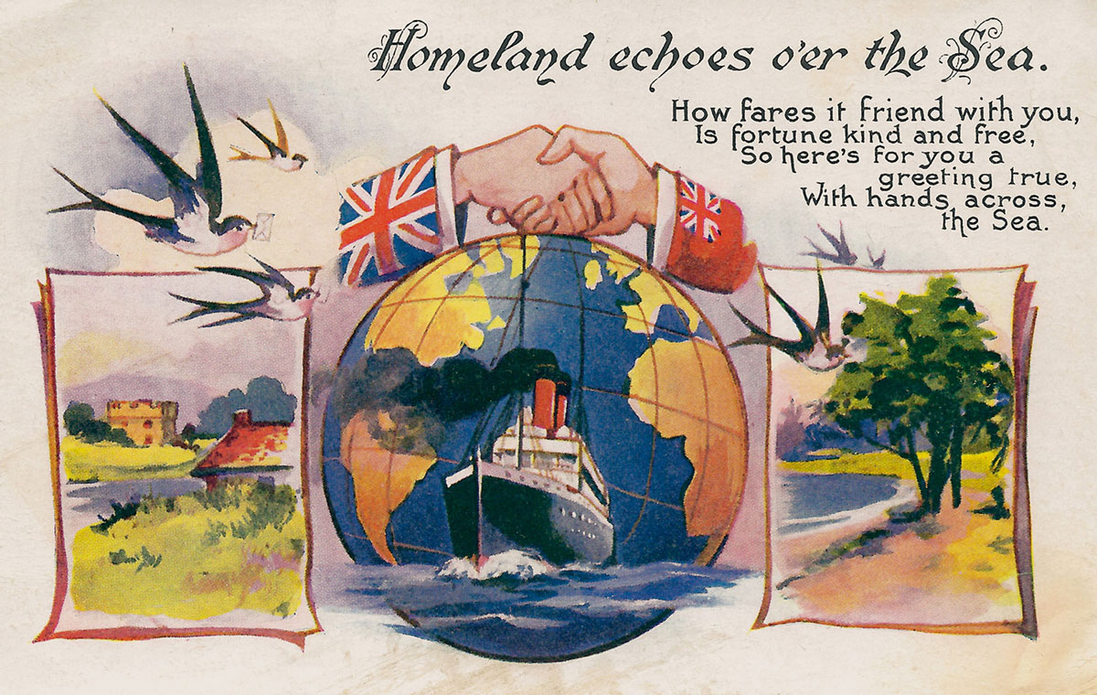
How fares it friend with you,
Is fortune kind and free,
So here’s for you a greeting true,
With hands across the Sea.
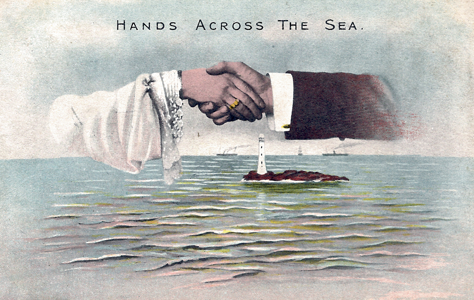
To start with, a very basic, very effective ideogram: two opposing hands, stretching across an immense distance to greet each other, clasped firmly together in friendship. Sometimes there are variations, with the hands simply reaching, or waving, or clinking glasses. But the message is clear: the desire to stay connected, to keep in touch, despite the vastness of physical separation. By comparison, the generic name for this type of image on a postcard, “Hands Across the Sea” (or HATS, to use the acronym of modern-day deltiology—that is, postcard-collecting), sounds cumbersome and long-winded, because no words could be as eloquent, as concise, as that single image.
In many ways, the HATS phenomenon was the apogee of the so-called Golden Age of picture postcards. Many genres of postcard benefited from the adoption of the “divided back” in 1907—which allowed space for a written message on the reverse and thus freed up the front for artwork—but few could match the sheer range of themes, imagery, and artistic styles of the designs that put HATS at the forefront of the worldwide craze for sending and collecting. More than any other kind of card, HATS managed to tap into the fears and desires that fed the growth of the Golden Age—namely, issues of distance, communication, and the dissolution of bonds of community. From the beginning of the twentieth century onward, with almost fifteen million British and Irish already living abroad and emigration rates still on the rise, HATS offered themselves to an eager Edwardian public as a vehicle for holding on to distant friends.
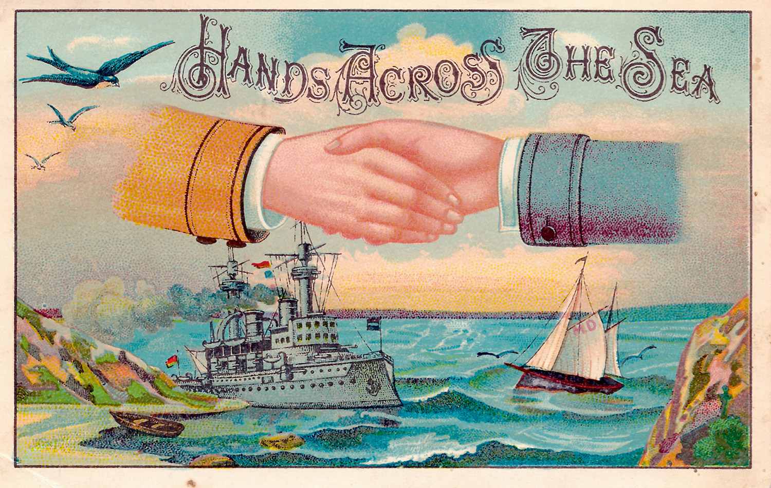
Every HATS postcard was intended to be a proclamation of friendship, an homage to its endurance, a reassurance of remembrance. As one of the numerous sentimental verses that they often featured put it, “distance may divide, but friendship will abide”—the means for its abiding, of course, being the card itself, a carrier of tidings, carried across the tides. And right from the beginning, ocean liners were an integral part of the HATS design, usually positioned prominently below the clasped hands—exactly the sort of vessel, of course, that had taken the emigrant away in the first place, but also the primary method for transporting post, for bringing back news of a faraway friend.
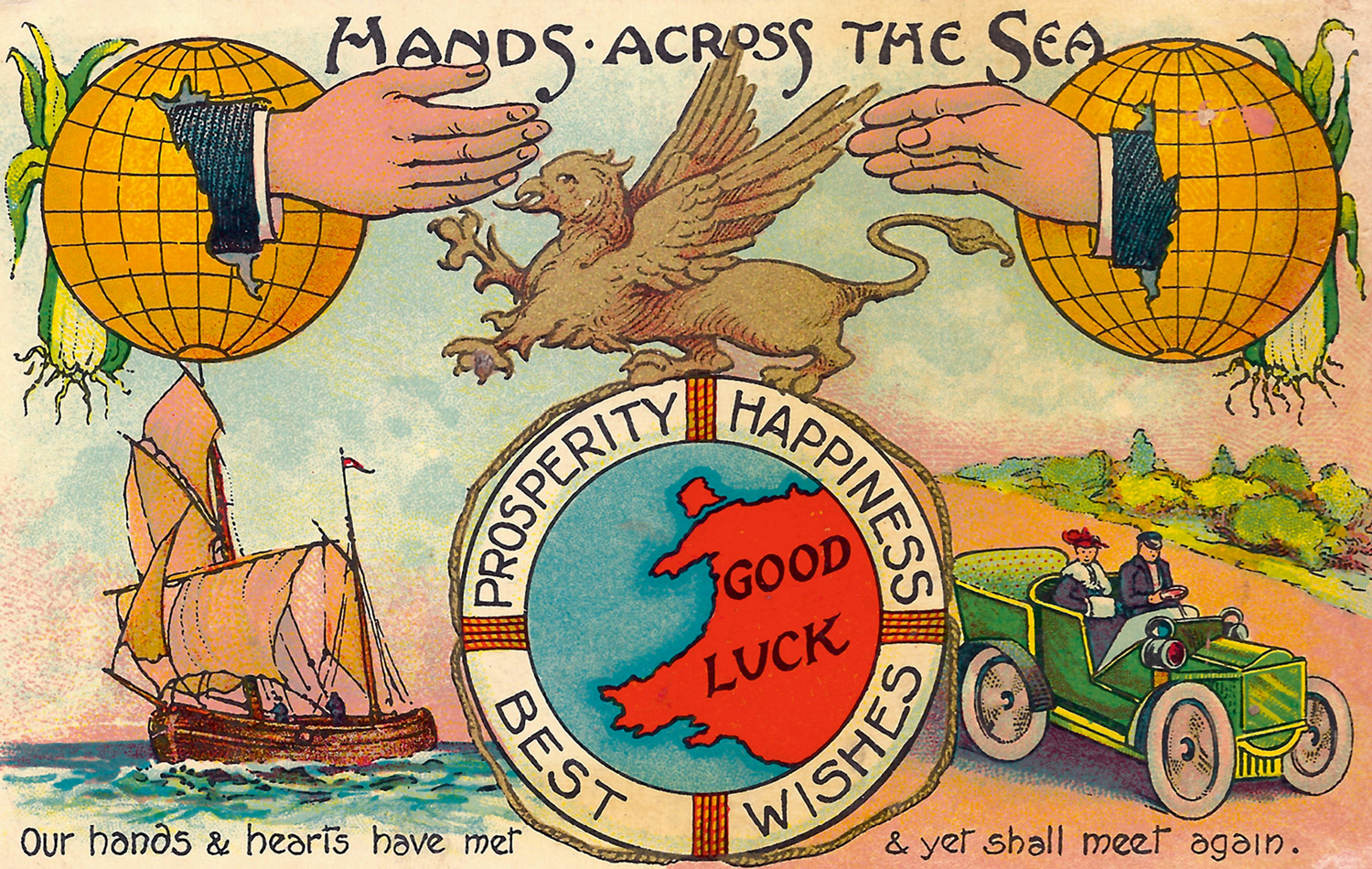
This dualism was reflected in the emergence of two different iconographic traditions. On the one hand, as it were, there were postcards commemorating particular ocean liners. Designed to be bought and sent as a souvenir of a voyage, with the handshake emblem positioned discreetly above a stock image of the ship and the whole scene portrayed in a neutral, hyper-realistic, “maritime” style, these depicted an idea of transportation bound up with notions of departure and emigration. The other dominant style featured the sorts of images more typically associated with the HATS genre: evocative, romantic portraits of ships plowing through stormy waters, or featuring other forms of transport such as trains sweeping across landscapes, or even occasionally biplanes, dirigibles, or early cars, together with images of globes or maps: a celebration of transportation as an enabler of communication, a closer of distance, as something heroic.
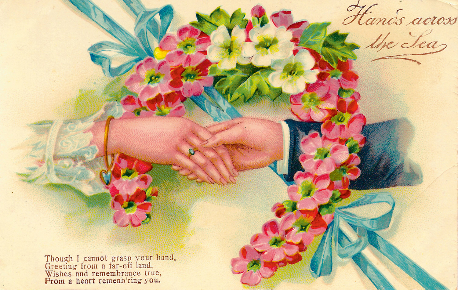
Beneath the twee rhymes, then, beneath the romantic visions and rhetoric of companionship, it’s possible to see HATS cards as a kind of extended meditation on transportation and communication, helping senders and recipients to come to terms with a radically changing world. It’s possible to imagine the sort of strange, almost talismanic aura that a HATS card might have held for contemporaries—for while nominally a mere greetings card, a HATS card was really a very special sort of object. Though sold alongside Christmas, birthday, and New Year’s postcards (this was before the introduction of folding-style cards), and sometimes even incorporating elements of these designs, HATS greetings were not primarily connected to any special occasion—or rather, the special occasion was simply the receipt of the card itself: a greeting card to commemorate greetings, then; the communication of friendly communication. The entire idea has a sense of magical symmetry to it—that an object should so neatly fulfill its mystical promise to “bridge dividing space,” as one common verse phrased it; should be able to be held by the hands of a recipient, having so recently been posted by the hands of a sender, halfway round the world.
Between the turn of the century and World War I, millions of HATS cards were produced, in thousands of different designs, by hundreds of companies around the world. It was an almost exclusively Anglophone phenomenon, with cards sent and received all over the British Empire (mainly centered on Canada, Australia, and New Zealand), as well as America. Initially, most cards seem to have been sent by emigrants—that is, by British colonists sending cards back home, or to friends and family in other Dominions; or by Americans sending cards to any number of homelands. Frequently, during this early phase, part of a card’s purpose was to provide an illustration, amidst the clasped hands and ships, of the sender’s adopted country, to give the recipient a flavor, no matter how stereotypical, of its character and novelty. This was accomplished either through national emblems, such as kangaroos to signify Australia, or beavers and maple trees for Canada, or through photographic imagery, as with Maoris rubbing noses on a card from New Zealand. Slightly later, cards sent out from Britain to emigrants also adopted this concept, as a reminder of homeland—so, a tartans-and-heather theme from Scotland, for instance. American cards, though, tended not to indulge in such flippancies, instead preferring the more stoic motif of a pair of crossed flags, the Stars and Stripes united with the standard of homeland.
Such representations of national identities, indeed, harked back to the earliest connotations of the phrase “Hands Across the Sea”: although its origins are unknown, it was in use in Britain and America by the 1890s to indicate a policy of promoting closer international cooperation, of diplomatic alliance and military assistance—that is, of friendships between countries, rather than individuals. This was the sense, certainly, meant by John Philip Sousa, the former leader of the US Marine Band and the so-called “March King” of America, when in 1899 he popularized the phrase by using it as the title for one of his marches.
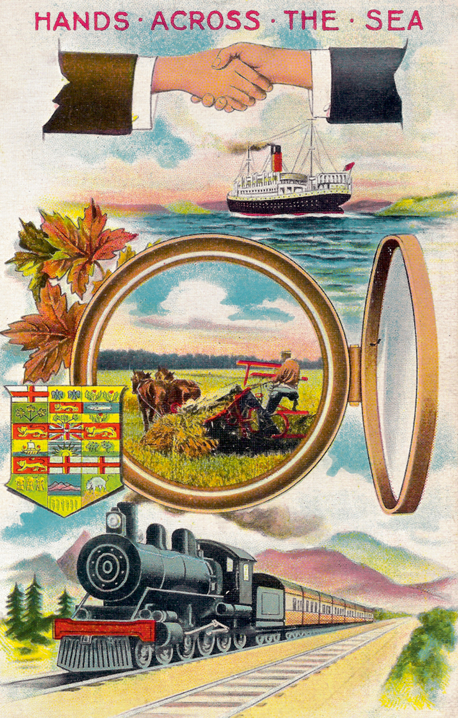
The earliest HATS postcards were still very much in this vein. Dating from around the turn of the century, “Stevengraph” cards—woven silk postcards made by the London firm of Thomas Stevens—offered only a stark depiction of crossed flags, clasped hands, and a line of text commemorating the name of a particular ocean liner. But by the start of the Golden Age in 1907 and the worldwide acceptance of the divided back (though the British postal system had already accepted this by 1902), the ideology of the cards had changed, reformulating the phrase as a paean to personal friendship. Their iconography had developed too: the handshake seemed to have relaxed, becoming less formal, more tender; floral themes and other prettified, decorative elements were often introduced and, most notably, whereas previously both the hands had been male, now one was frequently female. In short, the whole ideal of friendship had been feminized, softened, sweetened.
Throughout the Golden Age, HATS postcards seemed to be on a trajectory of ever-increasing emotionalism, their verses ever more lachrymose, their pictures ever more romantic. In cards sent between Britain and her Dominions, especially, a new, nostalgic theme came to dominate: the idea of the motherland, with images of green fields and thatched cottages, and scenes suggesting domesticity, familiarity, security. Flags could still be part of the iconography, but generally no longer signified fraternal comradeship. Rather, it was now solely the flag of home, often accompanied by images of a solitary lighthouse, along with verses heralding the “traveler” or “lonely wanderer.”
It’s these sorts of epithets that ultimately give the game away. Behind the hyperbolic veneer of HATS depictions, this was by now an age much more familiar with notions of transportation and mobility, where voyages did not necessarily imply permanent relocation, and where individuals had far greater opportunities to travel for temporary employment or pleasure. It was only at this stage, when distance was far less of an anxiety, when communication between friends was more certain, that HATS can be said to have become simply a kind of exaggerated pose, a piece of melancholy theater.
Some cards did end up abandoning the pretence, emptying themselves of all imagery whatsoever to do with distance, travel, or communication. A very different sort of visual language began to intrude: pastel-colored bows and ribbons, bunches of flowers and heart-shaped garlands, and clasped hands proudly showing off engagement rings were no longer an expression of friendship at all, but rather of love outright. And an indication of the eventual fate of HATS—absorption into the Valentine’s genre. But never completely, for, oddly, such cards still featured the HATS title, and even recycled earlier HATS verses about the sea, though there was no visual rationale.
As it happened, World War I intervened, marking the decline of HATS—indeed, of the entire Golden Age postcard craze. While the war initially provided new contexts for HATS imagery—“To the Girl I’ve left Behind Me”; “To my Brother at the Front”—the destruction of the German printing industry, whose expertise had always been responsible for actually producing most of the world’s postcards, soon crippled many card manufacturers. After the war, when sales began to pick up again for postcards—though never again at anything like the levels of the Golden Age—HATS cards nevertheless continued to dwindle, finally dying out sometime during the 1920s.
Partly, this was because the HATS phenomenon must have seemed hopelessly outmoded, a relic from a more innocent, even ignorant, era. More directly, it was a result of the wartime reliance on the telegraph and, especially, the telephone, which had changed people’s expectations of communication and friendship. Inevitably, postcards as a medium were affected, but HATS chiefly so, as the telephone seemed particularly suited to that which HATS had previously symbolized: the promise of bringing people closer together, of keeping old friends in touch. And as such, it’s interesting to speculate on the legacy of HATS, its possible influence on the language and imagery of telecommunications—the instruction to reach out and touch someone, for instance.
Gabriel Coxhead is a writer, art critic, and curator based in London. He is currently organizing the exhibition “No New Thing Under The Sun,” scheduled to open at the Royal Academy of Arts in November 2010.