Colors / Army Green
Half-alive at best
Alexander Keefe
“Colors” is a column in which a writer responds to a specific color assigned by the editors of Cabinet.
Late Motörhead front man and Nazi-memorabilia collector Lemmy Kilmister once said of his preference for the German side’s kit that he would have collected and worn British uniforms from the same period had their khaki color not made whoever put them on look “like a fucking swamp frog.” Much the same could have been said of the US Army’s World War II uniforms, characterized by an ochreous, greenish, khaki-like color known as olive drab. And Lemmy was not alone in his disdain for the dusty greens and taupes favored by the Allies; indeed, he was late to the game. Almost as soon as the war was over, mutters of dissatisfaction with olive drab in the United States turned into explicit concern. Army brass began to feel a pressing need for an appealing, ennobling color that could distinguish the army from its rivals—the other (generally blue-toned) branches of the US armed services. Committees were formed, reports drawn up, and after much debate it was decided that olive drab had to go, no matter the cost; the all-too-familiar sight of plumbers, garbagemen, and service station attendants working in battered, shit-brown Ike jackets across small-town America had finally put an end to whatever glimmer of romantic, colonial swagger had once attached to khaki and its confreres. And anyway, the colonial age was over, at least for the Brits—the war had put paid to that set of fantasies—and something new was beginning: call it the Cold War, call it the space age, call it the age of advertising. Call it Pax Americana or the beginning of America’s long half-century.
Whatever it was, it cried out for a new color, something plastic, identifying, unifying, and good. Reluctantly, the army also concluded that it would have to be some shade of green, an unfortunate color that, as historian Michel Pastoureau has pointed out, carries a profound ambivalence in the Western tradition—“a symbol of life, luck, and hope on the one hand, an attribute of disorder, poison, the devil and all his creatures on the other.”
This was not going to be easy.
Poison and springtime, nausea and new life, medicine and envy, grass and the devil: green is the most inconstant of colors—or so it was believed to be by early modern alchemists. When a Swedish chemist, Carl Wilhelm Scheele, invented the first modern, chemical green in 1778—Scheele’s green—one of its active ingredients was arsenic, then still poorly understood. Vibrant, appealing, and relatively inexpensive, Scheele’s arsenic-charged green quickly made its way into fashionable wallpapers, curtains, candles, ball gowns, and military uniforms across northern Europe and Britain, lending its color to an era. Paris green, a brighter, more emerald cousin to Scheele’s original pigment, was even more dangerous; beloved by plein-air impressionist and post-impressionist painters, it was also used to kill rats in the Paris sewers. Indeed, arsenic-based green pigments have been blamed for everything from accidental sweetmeat poisonings in Regency-era London to Napoleon’s death in a set of damp, green rooms on lonesome Saint Helena; from Monet’s blindness to Van Gogh’s madness, to be modern was to be spiked by the vapors of some shade of green.
Those arsenic greens were as vivid as they were deadly; anodyne army green, while no less dangerous in the broadest sense, works a far more banal juju. And that’s part of what makes it such a curious, even quixotic, color choice for the space age, especially given how much research went into it. It’s an ephemeral, rotten sort of green, half-alive at best, a fecund hue the color of spoilage on top of industrially produced hummus, the green of new grass growing up through the dense tangle of last year’s dead. Vincent van Gogh once wrote to his brother Theo that “it is impossible to say … how many different green-grays there are; it varies infinitely.” He didn’t know how right he was; army green, arguably the most successful and ubiquitous in this family, wouldn’t be invented for over half a century. The story of that invention is the story of what happened when the best and the brightest in America—everyone from the editor-in-chief of Vogue and the head of the Mellon Institute of Industrial Research to the future chairman of the Kestnbaum Commission—came together to solve the army’s color problem. These representatives of the power elite participated in the design and implementation of the new army green uniforms, alongside teams of color scientists and textile specialists who conducted thousands of hours of market research and testing at bases across Europe and the United States.
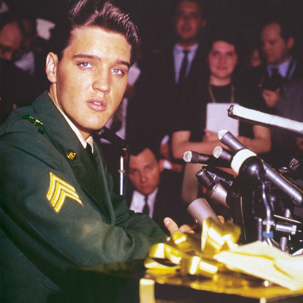
It required years of mass, organized effort to make army green look good; it would take just one man to make it look hot. Well, two actually: if it had been up to Elvis himself, he would have spent his mandatory stint in the US Army in the so-called Special Services, singing to the troops and living it up. But there was no way in hell his manager, Colonel Tom Parker, was going to let the army take control of Elvis’s recording career for even a day, let alone two years; instead, he cast the reluctant young draftee in the role of a regular joe, a jeep driver in a tank brigade headed for Cold War West Germany. It was partly a PR stunt, and partly a public rite of passage. Elvis in AG-44, the first of several designations used by the army for its green, managed to win not only the grudging respect of an older generation (which had until then mostly regarded him as a pervert and danger to America) but also the more specific affections of a teenaged Air Force brat named Priscilla. It was a weird couple of years for Elvis; he had ten Top 40 hits, his mother died, and he also developed a raging addiction to army-prescribed goofballs and uppers. But Parker was right in the end; Elvis returned to civilian life a bigger star than ever. He had proved that he was a man, “not only to the people who were wondering,” as he put it at the press conference held by the army to mark his discharge, “but to myself.” Photos from the event show his Melungeon pompadour intact, agleam like an orca’s fin over a taut, shimmering green. Less than a year later, he was starring in G.I. Blues, a sexed-up Technicolor musical metafiction (original title: “Cafe Europa”). You wouldn’t know it from the name, but G.I. Blues put army green—wrapped around Elvis as he rode around in a tank of the same color—on the big screen as never before.
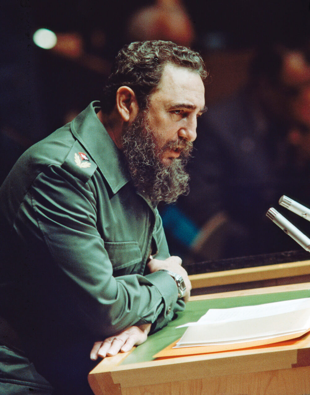
No wonder it all went so feral so fast. In 1960, the same year G.I. Blues was released, Fidel Castro showed up in New York to address the UN General Assembly. He was wearing army green. Fickle army green. By May 1963, Lieutenant General Hamilton H. Howze was moved to write Army Chief of Staff General Earle G. Wheeler: “A very tight rein should be kept on quality control,” he warned. “The issue-enlisted green uniform is soft and fuzzy, and so are many uniforms found on officers. All cloth should be of the hard variety, capable of accepting and keeping a sharp press.” Army green was going soft—and, worse still, fuzzy.
A color calibrated to project US hegemony at home and abroad, to naturalize that hegemony by affiliating it with what Van Gogh called “the grays of nature,” and to make the people wearing it look good, army green was destined to be stolen and repurposed. “Third World” guerrillas were wearing it by the early 1960s, and soon, so were antiwar protestors and rock stars. By the end of the decade, army green uniforms had become as closely identified with the hip militarism of the counterculture as with the national guardsmen who shot protestors at Kent State and elsewhere. Designed to project identity and stability, army green had come, by the time the Vietnam War ended in 1975, to mean something more like disunion and dissent, burnout and defeat. And then, in the decade after that, nothing very specific, its semiotics so overloaded that it became impenetrable, a thicket of kitsch and disaffection, a miasmic fog of bad vibes and nostalgia: John Lennon in New York, post-Beatles; Laurie Bird as the fungible, doomed Girl in Monte Hellman’s Two-Lane Blacktop (1971), bound for anywhere, waiting with her thumb out by the side of road; Travis Bickle in an M-65 field jacket (1976); Rambo showing up in 1982, quantum stranger at the edge of small-town America, he’s wearing army green. We all are.
Alexander Keefe is a writer living in Claremont, California. His work has appeared in Bidoun, East of Borneo, and Artforum, among other publications. He currently holds the inaugural Alan Erasmus Fellowship in Unpopular Culture at New York University’s Colloquium for Unpopular Culture.