Rectangle after Rectangle
How the picture frame was shaped
Amy Knight Powell
This is about the dominance of the rectangular format in a certain tradition of picture making, a dominance that still holds today and extends well beyond the medium of painting. The book, the photographic print, the screen, and the museum—which has tended to favor this format—all guarantee that we encounter most pictures in rectangular frames.[1]
A picture that comprises figure and ground requires an enclosed field. Without an enclosure, the space around its figure(s) will not necessarily read as part of the picture; enclosure is, therefore, the originary act that gives rise to the picture but also limits it. Nothing says this enclosure needs to take the shape of a rectangle, but the history of Western art, at least, makes the rectangle look like a virtually inescapable anatomical limit.[2] What follows are three episodes in the longue durée of this rectangle, each a moment in which the rectangular format moves into an ascendant position over one curvilinear format or another.
• • •
Episode One: The triumph of the rectilinear codex—the form of the book we still know today—over the curvilinear scroll, around the year 300.[3] This is not the beginning. The rectangular format appeared sometime after cave painting, let’s say, and well before the invention of the codex, in the murals, mosaics, relief sculptures, textiles, and other media of the ancient world. But with the invention of the codex, the rectangle acquired the force of a given, by virtue of the fact that codices, unlike murals, mosaics, and so on, almost universally adhere to that shape.
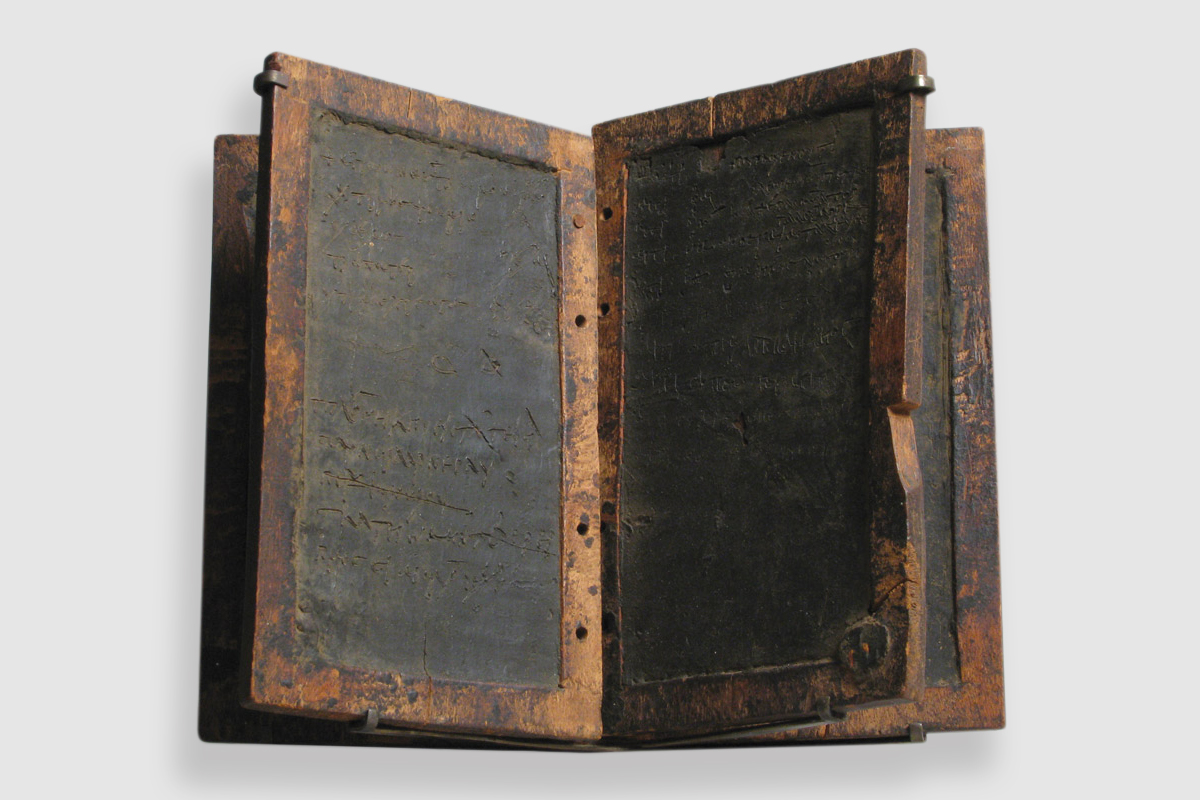
Before there were codices, there were curvilinear scrolls and rectilinear tablets. Most scrolls were made of papyrus, though some were made of parchment, including some of the famous Dead Sea Scrolls. Tablets were made of metal, clay, leather, or wood, sometimes with shallow depressions filled with wax that could be inscribed with a stylus and then smoothed again for another use. Several tablets could be strung together to form a rudimentary book.
In Greco-Roman antiquity, the tablet was a humble notepad for conducting business. As the repository for scripture and literature, the scroll had all the prestige. In the sixth century, the Roman statesman Cassiodorus wrote that tablets are “bits of sluggish wood,” whereas the papyrus scroll “is always plentiful; and it is so pliant that it can be rolled together, although it is unfolded to a great length. Its joints are seamless, its parts united.”[4] These sinuous structures were pulled straight in order to be read, but only ever partially and temporarily, before being rolled up again. The scroll, therefore, falls under the sign of the spiral, whose curvilinear lines go on indefinitely. By contrast, the tablet falls under the sign of the rectangle, whose straight edges intersect to form finite enclosures.
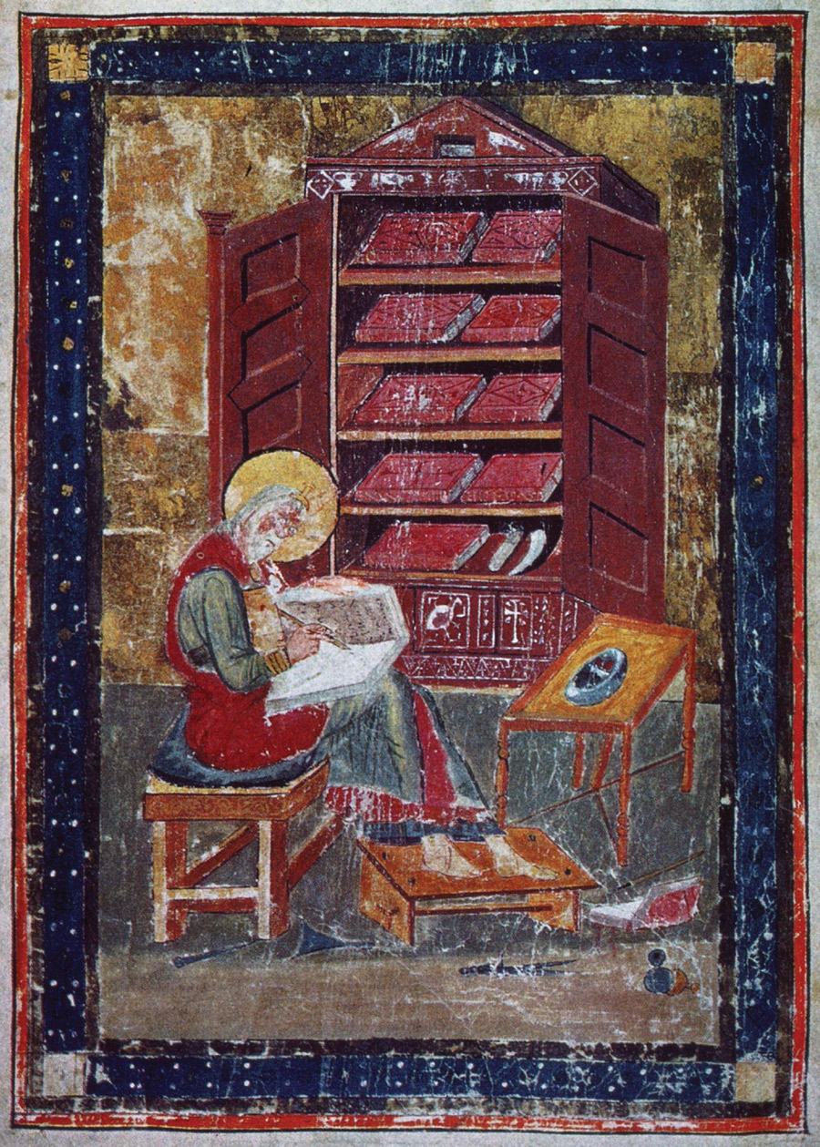
In the first century, the tablet evolved into the parchment codex. The codex then became the dominant form of the book in the fourth century in the Latin West and in the following century in Byzantium, displacing the scroll, though never completely. The furniture built to store the scroll and the codex reflects their respective shapes. In a tenth-century Byzantine gospel book, John the Evangelist is shown seated at a lectern mounted on a stem shaped like a dolphin, next to which stands a capsa, a cylindrical container for scrolls. The Codex Amiatinus (anachronistically) shows Ezra writing in a codex in front of a large bookcase. The rectilinear lines of this bookcase reflect its codices, while the curvilinear lines of John’s capsa reflect its scrolls.
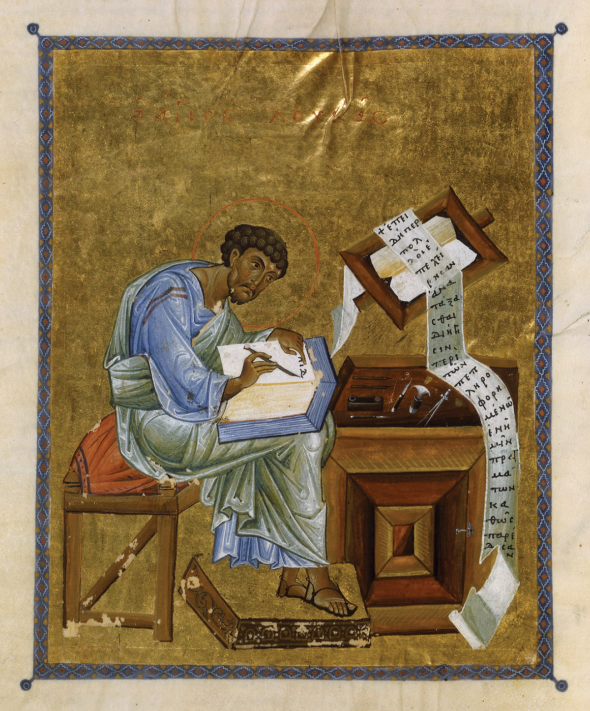
In a twelfth-century gospel book from Constantinople, Mark is pictured writing his gospel, as if this were a process of translation from the one format into the other, and as if this translation were a matter of setting things straight.[5] Gravity unfurls the scroll, straightening and cutting it into page-like segments where it falls over the lectern and again where it meets the floor. This process of rectification brings the scroll into alignment with the codex on Mark’s knees.
Images in codices endured an analogous process of rectification. In scrolls, text is lined up in columns with few, if any, breaks. This continuous length of text invites unframed or at least laterally open images that float across the surface of the scroll in its various states of being rolled and unrolled. By contrast, the codex’s sequence of separate leaves divides the text into discrete blocks, which invite the commensurate enclosure of pictorial space.[6]
The fragments that survive from the Milan Iliad (ca. 500 AD) are the earliest examples of codex illustration we happen to have, though what are said to be later copies of fourth-century books suggest that codices had been illustrated at least since the format became dominant. While they had been rare in scrolls, fully framed, rectangular miniatures like those in the Milan Iliad became common in codices relatively quickly. Housed in an upper and lower register within a rectangular frame, which originally sat above a rectangular block of text, two scenes of battle between the Greeks and the Trojans are filled with soldiers carrying circular shields. Saturated with color, the repeated, curvilinear shape of these shields forms the keynote of the composition, contesting the rectilinearity of the frame.[7]
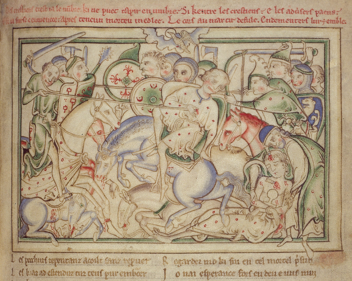
With the triumph of the rectilinear codex over the curvilinear scroll and the corresponding ascendance of the rectangular picture format, the picture became a binary structure of accommodation and resistance to the rectangle. The straight line was now the accommodating, and therefore unmarked, term; the curved line the resistant, marked term.[8] Though every picture housed in a rectangular codex is structured this way, throughout the history of manuscript illumination, battle scenes in particular have capitalized on this arrangement. The depiction of the Battle of Hastings in the manuscript Vie de seint Auban (The Life of Saint Alban), written and illustrated by Matthew Paris almost eight centuries after the Milan Iliad, once again pits curves against straights: here, shield, head, and rump against frame and piercing lance. Struggle between curves and straights is not restricted to battle scenes like these; it unfolds in ostensibly pacific miniatures as well, just because the curve is marked in opposition to the unmarked straight. Nor does it shape only manuscript pictures that have a border like the one around the pictures in the Milan Iliad and the Vie de seint Auban. In the absence of such a border, the page itself can do all the work.
And the page would keep on doing this work into the era of print, now aided and abetted by the increasingly industrialized manufacture of paper. Parchment had been produced on a relatively small scale. But in the period spanning the thirteenth through the fifteenth century, the spread of paper mills in Europe transformed the page into a mass-produced thing. The standard sizes and shapes that came with this mass production governed the format of printed material, ensuring that the page would continue to conform to the rectangle. Meanwhile, standardized paper became available to artists for drawings, including preparatory drawings for paintings—another means by which the rectangle would maintain its hold.
• • •
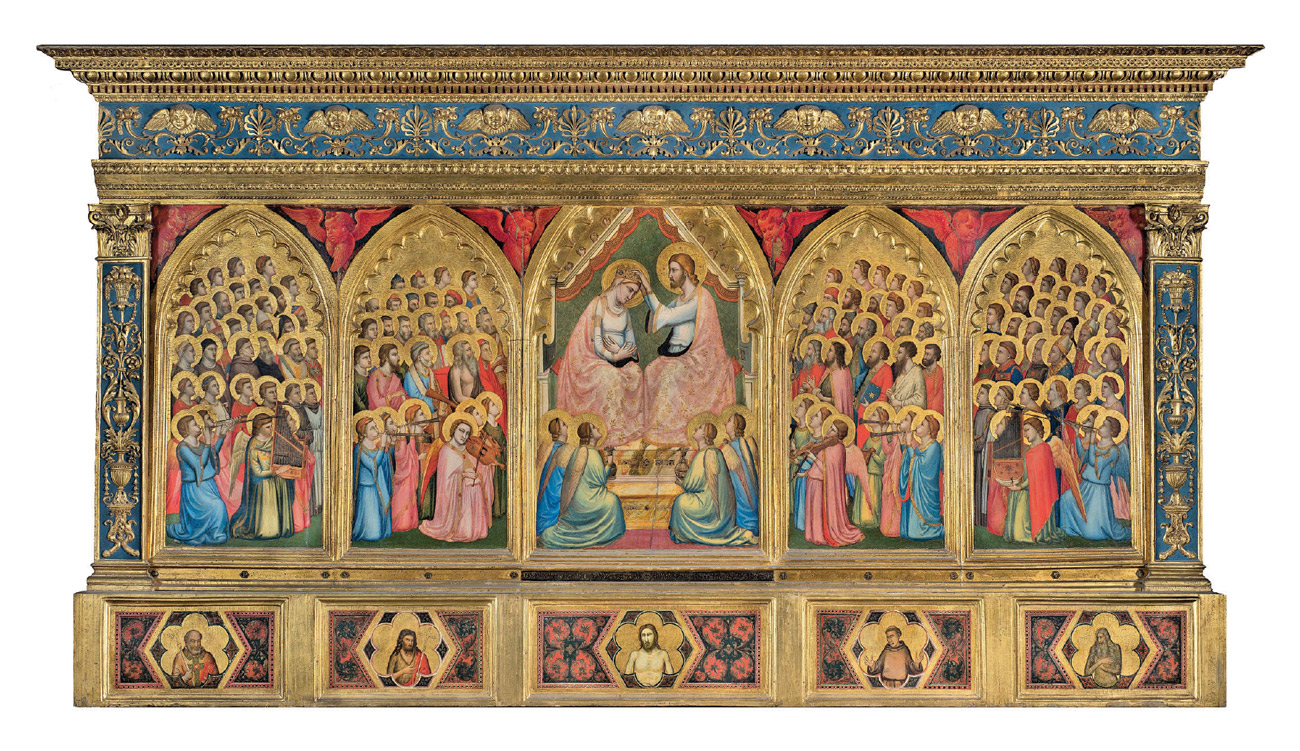
Episode Two: The Renaissance squares the Gothic. In the thirteenth century, most painted panels took the form of a (vertical) rectangle. This shape—sometimes modified by a pointed gable—governed the production of small as well as large paintings, including Coppo di Marcovaldo’s seven-and-a-half-foot-high Madonna and Child Enthroned of 1261.[9] This rectangle never gave way in Byzantium, but in the Latin West it suffered an eclipse during the Gothic period, succumbing to curvilinear flights of fancy that had evolved out of the Romanesque gable.
The upper edge of Fra Angelico’s Cortona triptych of 1437 sprouts arches, topped with gables of concatenated curves and straights, two of which enclose tondos. These arches originally had cusps along their inner edges, and the gables extended into little floriated points called finials. These curvaceous details rotted when a well-meaning parish priest shut the altarpiece up in an airless enclosure during World War II.
If you look at Fra Angelico’s triptych upside-down, you can see that the heads of the figures are plugged into this elaborate frame like balls in sockets. A woodcarver would have first assembled the panels and frame of a polyptych like this as an integral whole, before giving it to the painter, who could then insert his Virgin and saints into a structure that had anticipated the curves of their heads.
Gothic excrescences like these were relatively short lived. In Tuscany, the transition back to the rectangle began already in the 1430s.[10] In a document of 1434, Brunelleschi specifies that altarpieces made for the Basilica of San Lorenzo in Florence—whose interior he was in the process of renovating—should take the form of a “tabula quadrata et sine civoriis,” which is to say, a rectangular panel without crockets.[11] (Crockets are those little curved licks placed at regular intervals along the edges of many Gothic structures.)
Completed a few years later for the Martelli Chapel in the Basilica of San Lorenzo, Filippo Lippi’s Annunciation meets Brunelleschi’s specifications. A simple panel like Lippi’s would have been painted before it was framed and could therefore be moved from frame to frame.[12] Indeed, its current frame is not its original one, though it is thought to resemble it. Accordingly, the heads of these figures are not “plugged in.”[13]
Along with commissioning works in this new “tabula quadrata” format, patrons employed artists to bring paintings “made in the old manner with finials and foliate designs” up to date.[14] In 1424, Fra Angelico painted a triptych of the Madonna enthroned with saints for the high altar of the church of San Domenico near Fiesole. According to the chronicle history of the church, “in about 1501 … [this] altarpiece was remodeled into a square format and repainted … by Lorenzo di Credi.”[15] When he painted it, Fra Angelico’s San Domenico altarpiece probably looked like his Cortona triptych. During its renovation, the finials, gables, arches, and predella were removed. The whole was extended vertically to form a rectangle. The gold ground was replaced with a landscape seen through arched openings on either side of the Virgin’s throne. And the altarpiece was given a new frame, which opposes the “unplugged” curves of the figures’ haloed heads with long, sovereign straights.
Scholars have built a tight historical and corresponding conceptual link between the advent of the rectangular, Renaissance frame and the advent of linear perspective. It’s true that the renovation of Fra Angelico’s San Domenico altarpiece entailed both, but this was usually not the case. In 1480, about a century and a half after it was made, Giotto’s altarpiece for the Baroncelli Chapel in Santa Croce was renovated. Its original frame was removed and discarded, along with God the Father, who had occupied the gable above the heads of the Virgin and Christ. Spandrels decorated with vermilion cherubim were added, along with a new, rectangular frame that slices right through the curves of the cusped arches.
No new background in perspective was needed. To bring the painting up to date, it sufficed to change its shape—into a rectangle. This shape became so prevalent in Italy by the end of the fifteenth century that paintings came to be called quadri, even when they were round.
• • •
Episode Three: The cubist oval. In 1910, Georges Braque painted the first cubist oval, Woman with a Mandolin. Pablo Picasso immediately followed suit with his own oval painting of the same subject. Over the next three or four years, both artists used oval canvases repeatedly.[16] Then the oval canvas pretty much disappeared from their work. In the case of Picasso, whose oeuvre is so vast, the absence of further experimentation along these lines is striking.
The avant-garde Polish artist Władysław Strzemiński explained the short-lived cubist oval as a tool for intensifying the contrast between straights and curves. In his 1928 essay “Unism in Painting,” Strzemiński argues that, in cubist paintings on rectangular canvases, curved lines “are mainly grouped near the borders of the picture … [which] creates a contrast between the form of the picture … and its borders.” That this intensification of contrasts was intentional, he continues, is made evident by the “fact that in cubist pictures painted in oval frames, straight lines abound near the edges.”[17]
Strzemiński’s analysis of cubism picks up where Kazimir Malevich, with whom he had studied, left off. Around 1925, Malevich had made charts tracking the movement of modern painting toward abstraction.[18] He compared this project to a “bacteriological analysis, which clarifies the cause of sickness,” and framed his painterly specimens in circles, as if he were viewing them through a microscope, in which “is seen magnified a certain structure of straight and curved lines.”[19] For each artistic disorder—which he revalued positively as the motor of artistic evolution, as that which “destroys the norm of the generally accepted order in painting”—Malevich identified an essential formal element.[20] For cubism, it was the sickle shape.[21]
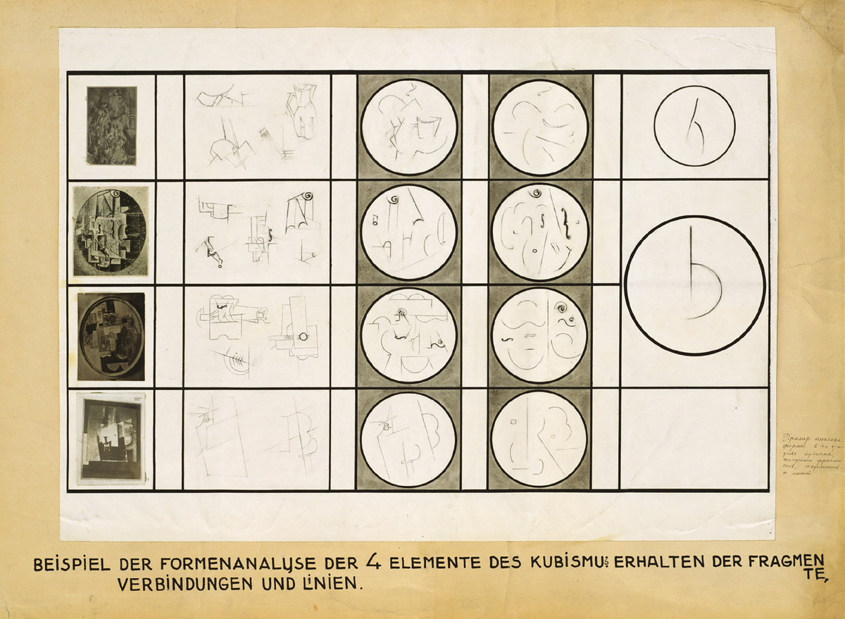
In the upper right corner of a Malevich-inspired diagram from 1928 titled Kontrast, Strzemiński illustrates his version of the sickle, which he describes as the essence of not only cubism but also the entire post-Renaissance painting tradition. Taking a long, structuralist view, he puts this whole tradition (cubism included) under the heading of a transhistorical “Baroque,” against whose “dualistic conception, … which finds its reason … in the power of struggling forces, … we have to oppose a conception of a picture as a reconciled and organic entity.”[22] For Strzemiński, like Malevich, cubism was a step in the right direction but one that did not go far enough, since it remained beholden to the compositional dynamics of the past.
But whereas Malevich uses the naturalizing metaphor of bacterial infection, Strzemiński insists that the contrasts between sinuous forms and the straight edges of the canvas found everywhere in post-Renaissance painting are neither natural nor necessary. Not only are such contrasts unnecessary, he argues, they are a form of needless violence, an elaborately contrived drama of “blows inflicted by lines against other lines.”[23] Dispensing with curves and the violence they entail would be, according to Strzemiński, a necessary step toward the creation of a painterly metaphor for a fully integrated socialist society. In practice, Strzemiński’s utopian rejection of curves was both incomplete and short-lived. Unism, as a movement, was over by about 1934.[24]
If Strzemiński bade farewell to the cubist oval—and the contrasts that it was intended to amplify—in words, Mondrian did so in paint. Mondrian was the painter who took up the cubist oval most enthusiastically, only to become, within a relatively short time, the one who abandoned it most decisively, along with all other curvilinear elements in his paintings.
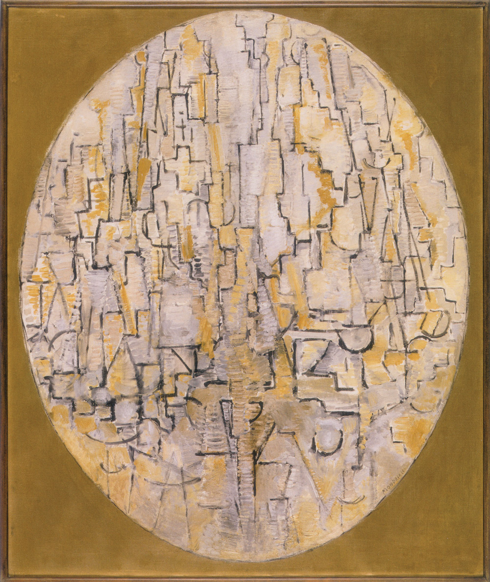
Mondrian began painting around 1888, producing one rectangular picture after another—until he encountered cubism.[25] In the fall of 1911, he saw early cubist paintings at an exhibition in Amsterdam; by spring of the following year, he had relocated to Paris. This encounter with cubism would move him in the direction of the orthogonal grid, but first he had to work through the oval. Mondrian never used an oval canvas, in fact, but between 1913, when he painted Tableau No. 3: Composition in Oval with Trees, and 1917, he used an oval framing device of one kind or another for every major painting.[26] Cubist ovals have often been exhibited in rectangular frames. They were exhibited that way already in the 1911 exhibition in Amsterdam. Mondrian’s ovals painted on rectangular canvases mimic that arrangement.[27]
For Tableau No. 3, Mondrian drew an oval border, confined his composition within it, and painted the area around it one color. Lines and colors fade as they approach this border—a strategy he also adopted from cubism. Tableau No. 3 belongs to a series of tree studies. Sweeping curves dominate the early phase of this series, but by the time he made Tableau No. 3, Mondrian’s push toward the straight line was underway; the already “very tense line only needed to become still more tense—until it became straight.”[28]
By the end of 1913, Mondrian had given up the organic tree motif and begun a series based on the architecture of Paris, which includes Oval Composition with Colored Squares 1 of 1914. In this series, the curves within the border become steadily fewer and more tense, in accordance with the rectilinear motif, while the curvature of the oval border holds.
Oriented horizontally, the oval of Composition 10 in Black and White (1915), also called Pier and Ocean, is Mondrian’s last. Moreover, the border is now the only curved form that remains, all the lines within it having been pulled straight. While Pier and Ocean still gestures toward a real-world motif, Composition in Line, painted a year or so later, marks Mondrian’s full entrance into abstraction. Here, he squares the cubist oval into a circle—the last instance of a curvilinear shape in his work. Reorienting, squaring, and then shedding the cubist oval were the final steps in his push toward the straight line and in his passage to abstraction.
While it appears clear that this passage to abstraction was, in part, a matter of acceding to the straight edges of the rectilinear canvas, this is not how Mondrian himself described it. He wrote endlessly about the straight lines, perpendicular lines, and rectangles he found everywhere in the world, even in sound, but he declined to mention the shape of his own canvases. In fact, he almost never utters the word “canvas” in his voluminous writings. For Mondrian, the rectangle was an idea. The rectangular canvas was the elephant in Mondrian’s room—unspeakable in its material contingency. Only by submitting to the rectangle absolutely, as a metaphysical principle, rather than a thing, could he make it seem necessary.[29]
• • •
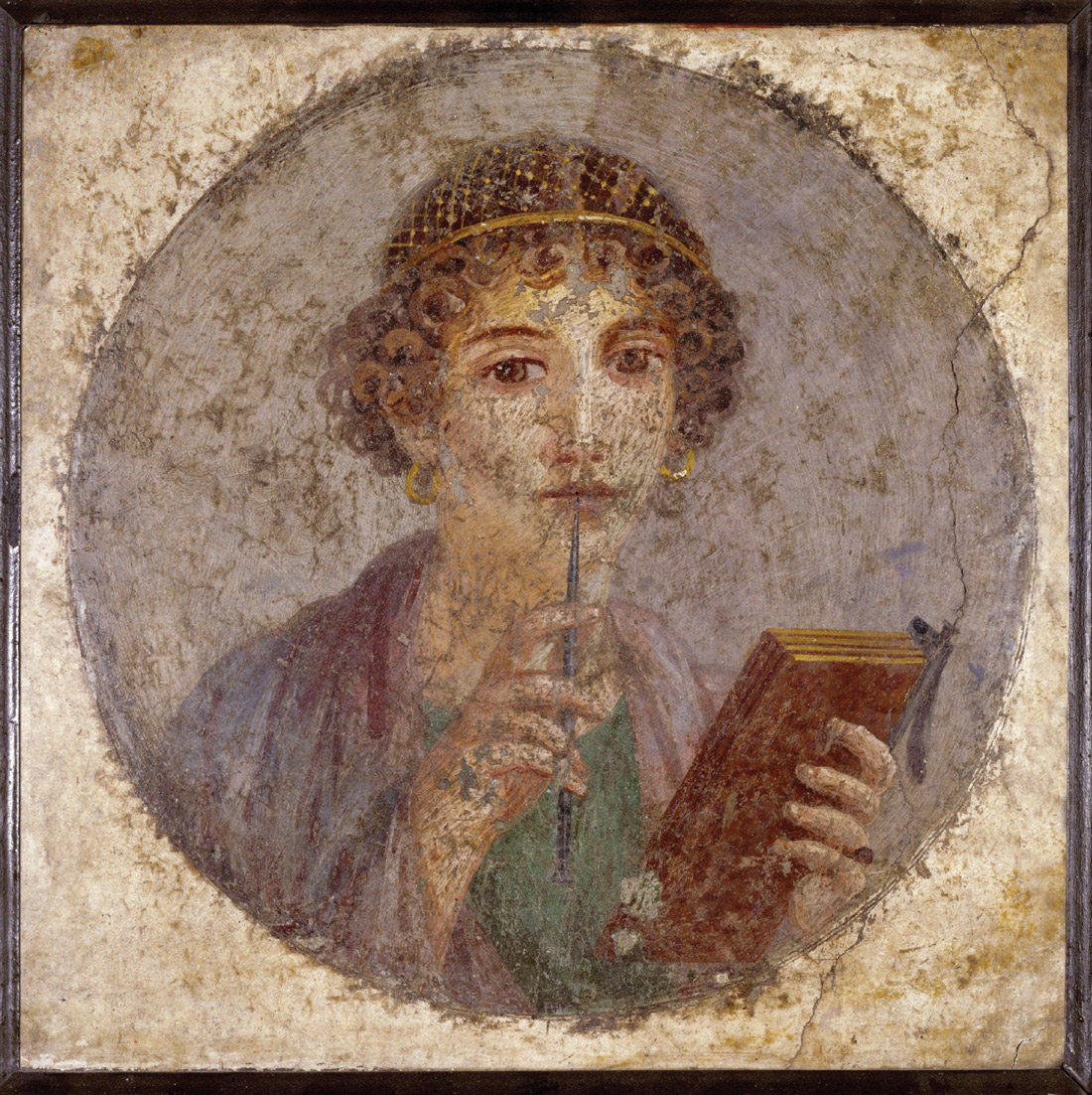
It was not necessary, but it was old. Extracted from its original context at Pompeii and marked with the inventory number 9084, the often-reproduced circular fresco portrait of a woman in the National Archaeological Museum of Naples acquired its rectilinear frame long after it was painted. But the straight lines of this belated frame are not entirely inappropriate. In fact, they match the rectilinearity of the writing tablets in the woman’s left hand. And because this rectilinearity passed to the codex, each time this portrait is reproduced in a book, the straight edges of the frame that the museum gave it fit perfectly, while the curves of its border as well as those of the woman’s face, eyes, gold-threaded hair, and earrings come to blows with the rectangle of the page—in what Strzemiński would have dismissed as an utterly arbitrary pictorial drama.
Strzemiński’s formalism aspires to be the end of the story. Of course, it’s not. It leaves the rectangular format itself untouched. Rather than denaturalize the rectangularity of the canvas along with the other elements of painting, Strzemiński accepts it as a given, calling it one of the “natural conditions that had already existed before the work of art was made. The terrain on which a painting arises.”[30] Strzemiński needs the rectangle to be an “innate quality” of painting, so that he has something from which every painterly composition, if it is to be an organic unity, can grow.[31]
This gives the rectangle both too much and too little credit: too much because it turns it into a law of nature rather than a matter of choice; too little because it underestimates its antiquity. In Strzemiński’s modernist tale, the Renaissance gave birth to the rectangular picture, initiating the entirety of what he calls the “Baroque” tradition.[32] But when Alberti wrote, “First of all, on the surface on which I am going to paint, I draw a rectangle,” he was simply reinstating the status quo. The rectangle was already in place, not because nature put it there, but because the process of its cultural transmission began long before Alberti put his pen to a rectangular sheet of paper.
The author wishes to thank Alexander Nagel for his insightful comments on this essay.
- “Painting may look outmoded, [but] the model of the ‘tableau’ is still active.” Hubert Damisch in “Hubert Damisch and Stephen Bann: A Conversation,” Oxford Art Journal, vol. 28, no. 2 (June 2005), p. 179.
- This all goes back to Meyer Schapiro, “On Some Problems in the Semiotics of Visual Art: Field and Vehicle in Image-Signs,” Semiotica, vol. 1, no. 3 (January 1969); and is taken up again in Hubert Damisch, “The Inventor of Painting,” trans. Kent Minturn and Eric Trudel, Oxford Art Journal, vol. 33, no. 3 (October 2010), pp. 301–316.
- The standard reference here is Colin H. Roberts and T. C. Skeat, The Birth of the Codex (London: Oxford University Press, 1983). Another excellent overview is Harry Y. Gamble, “The Early Christian Book,” in Books and Readers in the Early Church: A History of Early Christian Texts (New Haven, CT: Yale University Press, 1995).
- Magnus Aurelius Cassiodorus, Selected Variae, trans. S. J. B. Barnish (Liverpool: Liverpool University Press, 1992), p. 160.
- The scroll, inscribed with the opening lines of the Gospel of Luke, seems to stand here for the divine word, taking the place of those texts, sometimes included in portraits of the evangelists, held above their heads by the winged man, lion, ox, and eagle.
- On the enclosure of pictures in codices but not scrolls, see Kurt Weitzmann, Illustrations in Roll and Codex: A Study of the Origin and Method of Text Illustration (Princeton, NJ: Princeton University Press, 1970) and “Book Illustration of the Fourth Century: Tradition and Innovation,” in Studies in Classical and Byzantine Manuscript Illumination, ed. Herbert L. Kessler (Chicago: The University of Chicago Press, 1971); Otto Pächt, Book Illumination in the Middle Ages: An Introduction, trans. Kay Davenport (London: Harvey Miller; Oxford: Oxford University Press, 1986), pp. 25–26; Angelika Geyer, Die genese narrativer buchillustration: Der miniaturenzyklus zur Aeneis im Vergilius Vaticanus (Frankfurt am Main: Vittorio Klostermann Verlag, 1989).
- Illuminators borrowed from monumental wall painting as well as other media, such as relief sculpture, and their pictures were used as models for these in turn. The Milan Iliad is a case of evident borrowing. See Kurt Weitzmann, “Book Illustration of the Fourth Century”; Ernst Kitzinger, “The Role of Miniature Painting in Mural Decoration,” in The Place of Book Illumination in Byzantine Art, ed. Kurt Weitzmann, William C. Loerke, Ernst Kitzinger, and Hugo Buchthal (Princeton, NJ: The Art Museum, Princeton University, 1975); and Jonathan J. G. Alexander, Medieval Illuminators and Their Methods of Work (New Haven, CT: Yale University Press, 1992), p. 121.
- Rosalind Krauss calls the curve marked and the grid unmarked in cubism in her comments following Yve-Alain Bois, “The Semiology of Cubism,” in Picasso and Braque: A Symposium, ed. Lynn Zelevansky(New York: The Museum of Modern Art, 1992), p. 212.
- These are catalogued by shape in Edward Garrison, Italian Romanesque Panel Painting: An Illustrated Index (New York: Hacker Art Books, 1976).
- On the advent of the Renaissance pala, see “From Polyptych to Pala: Some Structural Considerations,” and “Lorenzo Monaco, Filippo Lippi und Filippo Brunelleschi: Die erfindung der renaissancepala,” in Christa Gardner von Teuffel, From Duccio’s Maestà to Raphael’s Transfiguration: Italian Altarpieces and their Settings (London: The Pindar Press, 2005); Megan Holmes, Fra Filippo Lippi: The Carmelite Painter (New Haven, CT: Yale University Press, 1999), pp. 102–128; and George Bisacca, “The Rise of the all’antica Altarpiece Frame,” The Frame Blog (18 June 2015). The latter is available at http://theframeblog.com/2015/06/18/the-rise-of-the-allantica-altarpiece-frame. Megan Holmes qualifies this chronology: “However, the gold-ground polyptych persisted as a powerful alternative, even in the work of the two artists [Fra Angelico and Fra Filippo] responsible for introducing and popularizing the new formula.” See her Fra Filippo Lippi, p. 121.
- Jeffrey Ruda, “A 1434 Building Programme for San Lorenzo in Florence,” The Burlington Magazine, vol. 120, no. 903 (June 1978), p. 361.
- On this new autonomy, see Creighton Gilbert, “Peintures et menuisiers au début de la Renaissance en Italie,” Revue de l’Art, no. 35 (1977).
- On the new format’s relation to religious reform, see Alexander Nagel, “Art as Gift: Liberal Art and Religious Reform in the Renaissance,” in Negotiating the Gift: Pre-Modern Figurations of Exchange, ed. Gadi Algazi, Valentin Groebner, and Bernhard Jussen (Göttingen: Vandenhoeck and Ruprecht, 2003).
- These are the words of artist Neri di Bicci, who records renovating a number of such altarpieces made “according to the usage of that older time.” These he “restored and brought back to the taste of today, that is, with pilasters on either side, and above an architrave with a frieze and a cornice.” Neri di Bicci, Le ricordanze (10 marzo 1453–24 aprile 1475), ed. Bruno Santi (Pisa: Edizioni Marlin, 1976), pp. 382–383; as translated in Cathleen Hoeniger, “The Reframing of Gothic Altarpieces during the Renaissance,” in The Renovation of Paintings in Tuscany, 1250–1500 (Cambridge: Cambridge University Press, 1995), p. 106.
- As translated in Cathleen Hoeniger, “The Reframing of Gothic Altarpieces,” p. 120.
- Harry Cooper argues that they retrieved this format from “what was then considered to be the modernist dustbin of history (Rococo portraiture).” See Harry Cooper, “Braque’s Ovals,” in Picasso and Braque: The Cubist Experiment, 1910–1912, ed. Eik Kahng (Santa Barbara, CA: Santa Barbara Museum of Art; Fort Worth, TX: Kimbell Art Museum, 2011), p. 40. He also appraises earlier accounts of the cubist oval as, for example, a way of dealing with the “problem of corners.”
- Władysław Strzemin´ski, “Unism in Painting,” as translated in Constructivism in Poland 1923–1936, ed. Ryszard Stanisławski, trans. Piotr Graff and Eva Krasin´ska (Łódz´: Muzeum Sztuki w Łodzi, 1973), p. 90.
- Linda S. Boersma, “On Art, Art Analysis and Art Education: The Theoretical Charts of Kazimir Malevich,” in Kazimir Malevich 1878–1935, ed. Wim Beeren and Joop Joosten, trans. Ruth Koenig (Amsterdam: Stedelijk Museum, 1988).
- Kazimir Malevich, “An Introduction to the Theory of the Additional Element in Painting,” in The World as Non-Objectivity: Unpublished Writings 1922–25, ed. Troels Andersen, trans. Xenia Glowacki-Prus and Edmund T. Little (Copenhagen: Borgen, 1976), pp. 166–167. On Malevich’s pathologizing of abstraction, see Mark A. Cheetham, Abstract Art Against Autonomy: Infection, Resistance, and Cure Since the 60s (Cambridge: Cambridge University Press, 2006), pp. 4–19.
- Kazimir Malevich, “An Introduction to the Theory of the Additional Element in Painting,” p. 150. He continues: “New art is considered morbid by the larger part of learned and non-learned society and criticism, and from the point of view of new arts the situation is reversed, the majority are considered abnormal.” Malevich thereby turned the “morbid derangement” (p. 168) associated with avant-garde art on its head.
- On Malevich’s sickle, see Yve-Alain Bois, “Semiology of Cubism,” p. 182.
- Władysław Strzemin´ski, “Unism,” p. 92.
- Ibid., p. 90.
- See Yve-Alain Bois, “Strzemin´ski and Kobro: In Search of Motivation,” in Bois, Painting as Model (Cambridge, MA: The MIT Press, 1990).
- Joop Joosten, “Mondrian: Between Cubism and Abstraction,” in Piet Mondrian 1872–1944: Centennial Exhibition (New York: Solomon R. Guggenheim Museum, 1971).
- Ibid., p. 59. This work is also known as Tableau No. 3: Composition in Oval; the Stedelijk Museum, which owns the painting, uses this title.
- Some cubist oval paintings have even been restretched onto rectangular frameworks. See Claire Barry and Bart J. C. Devolder, “Surface and Format: Observations on the Materials, Process, and Condition of Cubist Paintings, 1910–1912,” in Picasso and Braque: The Cubist Experiment, p. 113.
- Piet Mondrian, “The New Plastic in Painting” (1917) in The New Art—The New Life: The Collected Writings of Piet Mondrian, ed. and trans. Harry Holtzman and Martin S. James (Boston: Hall & Co., 1986), p. 64. Translation modified. See Yve-Alain Bois, “The Iconoclast,” in Piet Mondrian, 1872–1944, ed. Angelica Zander Rudenstine (Boston: Bulfinch Press, 1995).
- Hubert Damisch, “L’éveil du regard,” in Fenêtre jaune cadmium, ou les dessous de la peinture (Paris: Seuil, 1984), pp. 65–66: “This painter who claimed to leave nothing to chance would not in fact cease to work with automatism, in the surrealist sense of the term. Starting from the blot and its avatars and starting from the tableau and the constraints that define it as such, though they appear contradictory, … overlap and pose analogous problems.” My translation.
- The quotation is from an essay co-written in 1931 by Katarzyna Kobro and Władysław Strzemin´ski, and translated as “Composition of Space” in Constructivism in Poland, p. 107.
- Władysław Strzemin´ski, “Unism,” p. 93.
- “The Baroque came about when a picture ceased to be a part of a wall decoration.” Ibid., p. 86.
Amy Knight Powell is an associate professor of art history at the University of California, Irvine, and the author of Depositions: Scenes from the Late Medieval Church and the Modern Museum (Zone Books, 2012). She is currently working on a book titled “The Whitewashed Image: Iconoclasm and Seventeenth-Century Dutch Landscapes.”
Spotted an error? Email us at corrections at cabinetmagazine dot org.
If you’ve enjoyed the free articles that we offer on our site, please consider subscribing to our nonprofit magazine. You get twelve online issues and unlimited access to all our archives.