Leftovers / How to Use Scotch Tape
Stick-to-itiveness
Paul Lukas
“Leftovers” is a column that investigates the cultural significance of detritus.
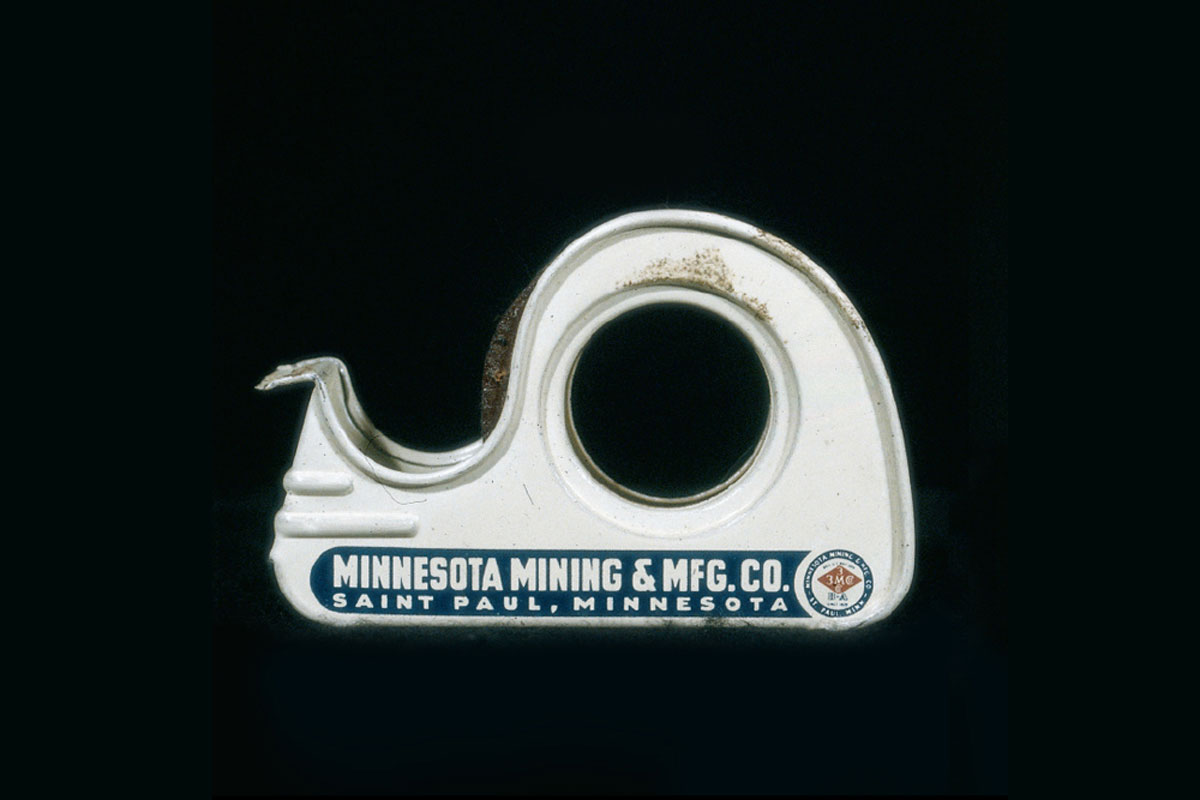
We’ve all heard the cliché about “the gift that keeps on giving.” Those words never rang truer for me than they did last Christmas, when a friend of mine gave me a small, stocking-stuffer-ish gift: an old metal Scotch tape dispenser from 1942, scavenged at a secondhand store, its tape roll still intact but now hopelessly gummed up. At first glance it appeared to be just another eye-pleasing tchotchke given from one design geek to another. Upon closer inspection, however, it has turned out to be a veritable treasure trove of corporate and design history.
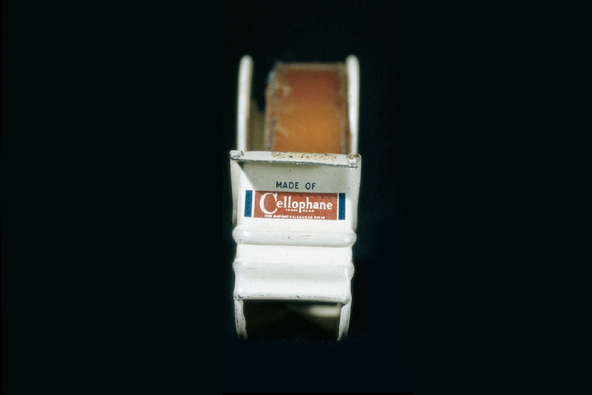
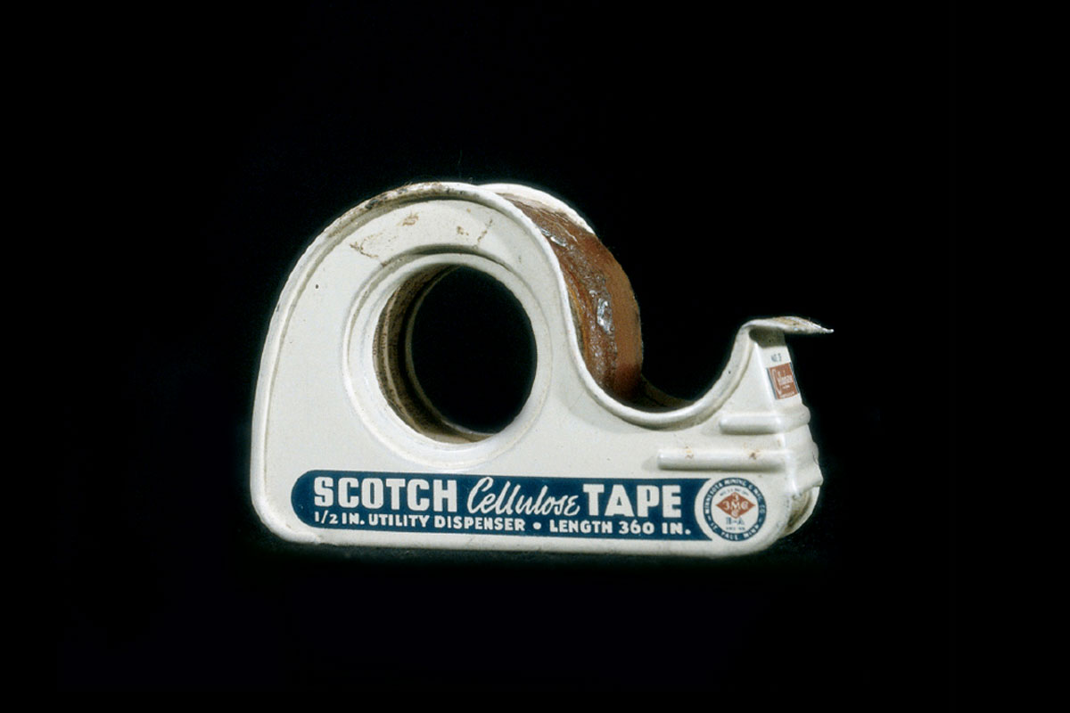
All artifacts are historical documents, of course, but the Scotch tape dispenser offers an unusually broad window on several historical fronts, in part because both the product and its manufacturer, 3M, remain staples of the consumer landscape today, making time-wrought changes easy to gauge. Let’s start with the product name itself, which is printed on the dispenser’s side: Scotch Cellulose Tape. This sounds vaguely off, because most of us would think of it as cellophane tape, not cellulose. But cellophane is a cellulose derivative, and in 1942 it was a trademarked product of DuPont, which would not allow 3M to use it as part of the product’s name. That is also why the dispenser’s front panel features a little logo seal that reads: “Made of Cellophane [Trademark], The DuPont Cellulose Film.”


Although Scotch is a ubiquitous brand today, its familiar plaid design motif is absent on the dispenser. In order to understand why, we need to go back to the origin of the brand name itself. “Scotch” was born in 1925, when a 3M engineer named Richard Drew created a form of masking tape that he envisioned being used by auto painters. But his two-inch-wide tape had adhesive only at the outer edges, not in the middle, much to the frustration of a local painter who tried one of Drew’s prototype rolls. As the tape kept falling off the surfaces to which it had been applied, the exasperated painter told Drew, “Take this tape back to those Scotch bosses of yours and tell them to put more adhesive on it!” In this context, “Scotch” was an ethnic slur connoting stinginess—an unlikely source for a brand name, but one that served 3M well during the Depression, when Scotch tape became a symbol of thrift and do-it-yourself mending. This helps explain the brand’s rather austere blue-and-white design visage during its first two decades of existence. The more playful plaid motif appeared in 1945, as national optimism surged in the wake of WWII.
On the other side of the dispenser, in block letters, is the manufacturer’s name: Minnesota Mining & Mfg. Co. Many of us have forgotten—indeed, if we ever knew—that these words are the source of 3M’s three ems. Indeed, 3M has become so synonymous with high-tech polymer innovation that a hardscrabble activity like mining seems hopelessly old-economy by comparison. But in fact the firm was founded in 1902 by a group of Minnesota investors who planned to mine a mineral deposit for grinding wheel abrasives. The abbreviation “3M”—not quite an acronym, more like a ligature—entered the corporate lexicon soon enough, but old-timers in the Twin Cities region still refer to the company as “Mining” (as in “Oh sure, I used to work for Mining”). Those looking for present-day manifestations of the company’s old name will be pleased to learn that 3M’s stock-ticker symbol is MMM, and that its Internet domain name is mmm.com.
3M’s nomenclatorial transition from unwieldy 15- syllable name to two-character symbol was already under way in the early 1940s, as is evident in the company’s old logo, which is printed on both sides of the tape dispenser. The spelled-out name and “3M Co.” both appear on the logo, a busy jumble of typography and geometry. That logo design is a variation on one that first appeared in 1906; its basic diamond-within-a-circle template remained 3M’s visual signature until 1950, when the first of several revisions took place. Each subsequent logo facelift has moved toward simplicity, culminating—for now, at least—in the current 3M logotype, whose simple sans serif typography was designed by the New York firm Siegel & Gale in 1977.

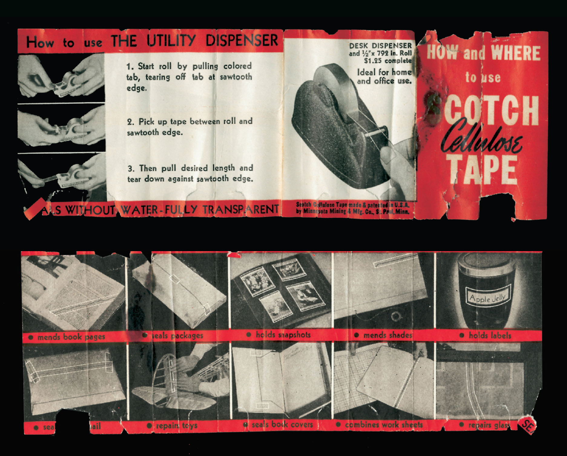
Tucked into the dispenser is a small instruction sheet. Imaginatively entitled “How and Where to Use Scotch Cellulose Tape,” it uses a series of captioned illustrations to explain the product’s function. Repeated mention is made of the dispenser’s “sawtooth edge”: One caption instructs the consumer to “pick up tape between roll and sawtooth edge”; another helpfully tells the user to “pull desired length [of tape] and tear down against sawtooth edge.” While all this may seem superfluous today, it’s worth remembering that the first tape dispenser with a built-in cutter blade didn’t appear until 1932, and the design patent for this one (one of many patents listed by number on the dispenser’s bottom panel and, like all American patents, accessible at the United States Patent and Trademark Office’s website, www.uspto.gov) wasn’t filed until 1939. So 3M’s decision to leave nothing to chance may well have been warranted.
As it happens, the whole thing will soon come full circle, because the instruction sheet is all tattered and crinkled and looks like it’s about to fall apart. At which point I will reach across my desk, deploy a certain sawtooth edge, and patch the sheet back together with some fresh Scotch tape.
Paul Lukas, author of Inconspicuous Consumption: An Obsessive Look at the Stuff We Take for Granted and editor of Beer Frame: The Journal of Inconspicuous Consumption, is a Brooklyn-based writer who specializes in minutiae fetishism. His favorite color is green and his favorite state is Wisconsin.
Spotted an error? Email us at corrections at cabinetmagazine dot org.
If you’ve enjoyed the free articles that we offer on our site, please consider subscribing to our nonprofit magazine. You get twelve online issues and unlimited access to all our archives.