Artist Project / Dust Rainbow-Rainbow Dust
Santiago Borja

The painter had tried it before in a 1:1 scale model in an old carriage station. Though another place and another time, he still had to diffuse the light with parachute silk, as if to render the sun a gigantic bulb—a homogenous, static source of light. There he painted the monochromes, in dim candlelight. He expected that the sunlight in any other given place would be the same, no matter the latitude.
For the room or chamber, he imagined an octagonal plan and a group of paintings, mostly triptychs. “A study on proportion,” he said. They worked hard to try to convince Phillip Johnson to be part of it, but before long, the architect had dropped the commission for the so-called chapel. He knew the painter wouldn´t abide anything other than a volumeless panorama.
So yes, this is a space thought of as pure interiority, removed from any contingency such as climatic conditions and the like. No possible outside, no beyond. Almost no architecture. Just a stage—perhaps a decor. An inside and an outside that never touched each other. No surprise, then, that the shape of the building is entirely residual, a by-product of its inner core. Just the literal result of a space designed for flat images.
In this everlasting inside, he wanted to be autonomous, separate from other works, other artists, other people. He wanted a special place for contemplation as distant as possible from concrete reality, one conceived as an introspective panorama producing a wrap-around experience, an oceanic feeling. It was to be a place where the paintings could not be seen independently or simultaneously, an event unfolding in a nonlinear sequence, an origami experience, where center and periphery become indistinguishable. Here Leonardo´s motto, La pittura è cosa mentale, takes on a whole new dimension.
On the other hand, theatricality inevitably springs to mind—that forbidden word that supposedly deprives art, and its display, of all seriousness. But then again, everything is artificial, constructed, a set. Frances Yates and her memory theater could be our reference here, but Dore Ashton’s recollection of her visit to the carriage station will do: “Rothko had no lights on, and the great space was dim as a cathedral. When a tiny white cat sprang into the center of the room it was a shock. I felt as though I had walked into a theater, or into an ancient library. The only perceptible object in the huge space was a table, very small in its isolation. Rothko watched my reaction as I examined the arrangement of large canvases and said, ‘I have made a place.’”
A place out of this world in any case, and yet, this idea of a place produced in the most abstract way and then transferred somewhere else, is still out there for us to be in.
• • •
In his seminal book on minimalism, Ce qui nous voyons, ce qui nous regarde, Georges Didi-Huberman starts by establishing that an image becomes irrevocable once we have the feeling that in seeing it, we haven’t actually possessed or gained anything. On the contrary, seeing it has made us realize we have lost something. That loss, that thing that flees from our regard, haunts us, stares back at us.
He proposes two different paths that we could take to deal with this rupture, that of tautology, where things are what I see they are and what I don’t see doesn’t exist, and that of belief, where we imagine something replacing that loss. The first one addresses only what we actually have in front of us; the second one consists in making from the experience of seeing an exercise in believing. Through believing, we see beyond what we actually see.
Recycling Walter Benjamin’s notion of allegory (melancholy and irony put together), Didi-Huberman proposes the notion of a dialectical image that is neither tautological nor anchored in a belief system—an image that could possibly build a bridge between these two apparently irreconcilable positions. Here, if we cannot conjure a dialectical image, we can offer an ambiguous one, one that does not simply glorify belief or claim a cynical absence of sense but enhances both simultaneously.

The notion of an ambiguous image can prove helpful in dealing with Rothko’s ambivalence about his own position: torn between being a modern painter whose work is devoid of any metaphysical implications and his mystical quest for profound human emotions. And interpretations of his work have been similarly divided between those who detect a transcendentalist intention and those who believe Rothko´s work was solely concerned with the inherent material qualities of painting itself. It´s not by chance that the ambivalent phrase “apocalyptic wallpaper”—intended as a kind of insult—seems to best describe what is at stake here.
And perhaps this is exactly what we find in Rothko’s monochromes (I shouldn’t be using this word anyway): an image that is both tautological and spiritual, or, to use modernist jargon, a color field that defies mere superficiality. So why not embrace materialistic mysticism, or transcendental flatness, or any other given name we may deem appropriate?
His own writings add to the confusion as he sometimes defends the most materialistic of positions: “The difference between me and Reinhardt is that he’s a mystic. By that I mean that his paintings are immaterial. Mine are here. Materially. The surfaces, the work of the brush and so on. His are untouchable.” But in the same breath, he asserts that he “wanted to paint both the finite and the infinite.”
And then there is the artist’s terrible ending—the insurmountable melancholy that made him breathe paint on canvas. This would inevitably link his somber paintings to despair, perhaps the result of an irreconcilable mixture of color lust and nostalgia, of pure pigment and metaphysical light. What else is there under the black sun if melancholy sets in as the glue for a fragmented self?
• • •
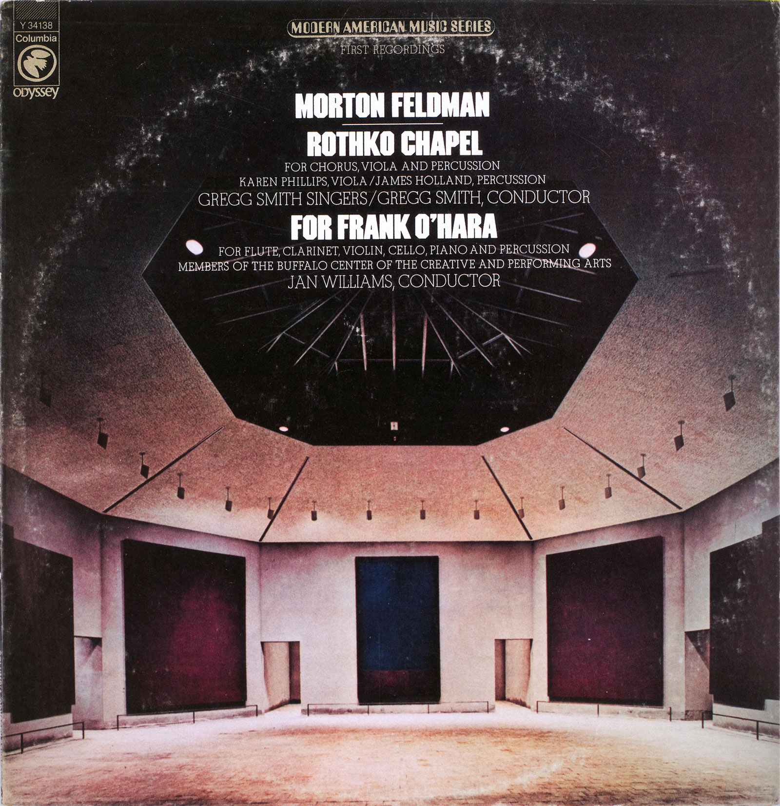
The Morton Feldman album cover features the Rothko Chapel with the original skylight from the 1970s. Probably taken shortly after the opening of the chapel, it depicts the space as it was meant to be: ideal, symmetrical, and canonically classic in its design, almost like a Greek theater or a metaphysical landscape.
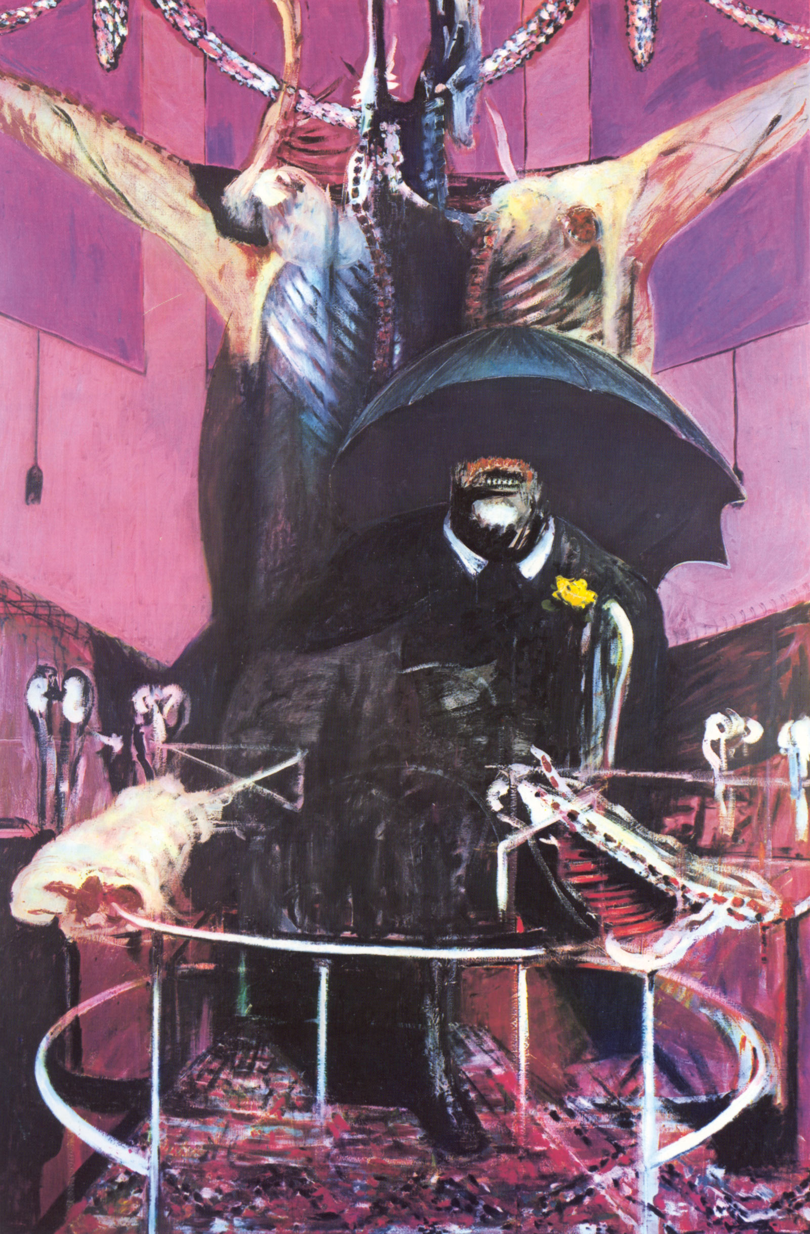
But, in the back of my head, this image is strongly linked to Francis Bacon’s famous Painting (1946). Here, the black umbrella both protects and terrifies—a dark hole at the center of the image, maybe the punctum. Then there are the matching colors, the circular arena, the background triptych and the blocked windows, the deceptive tautological title.

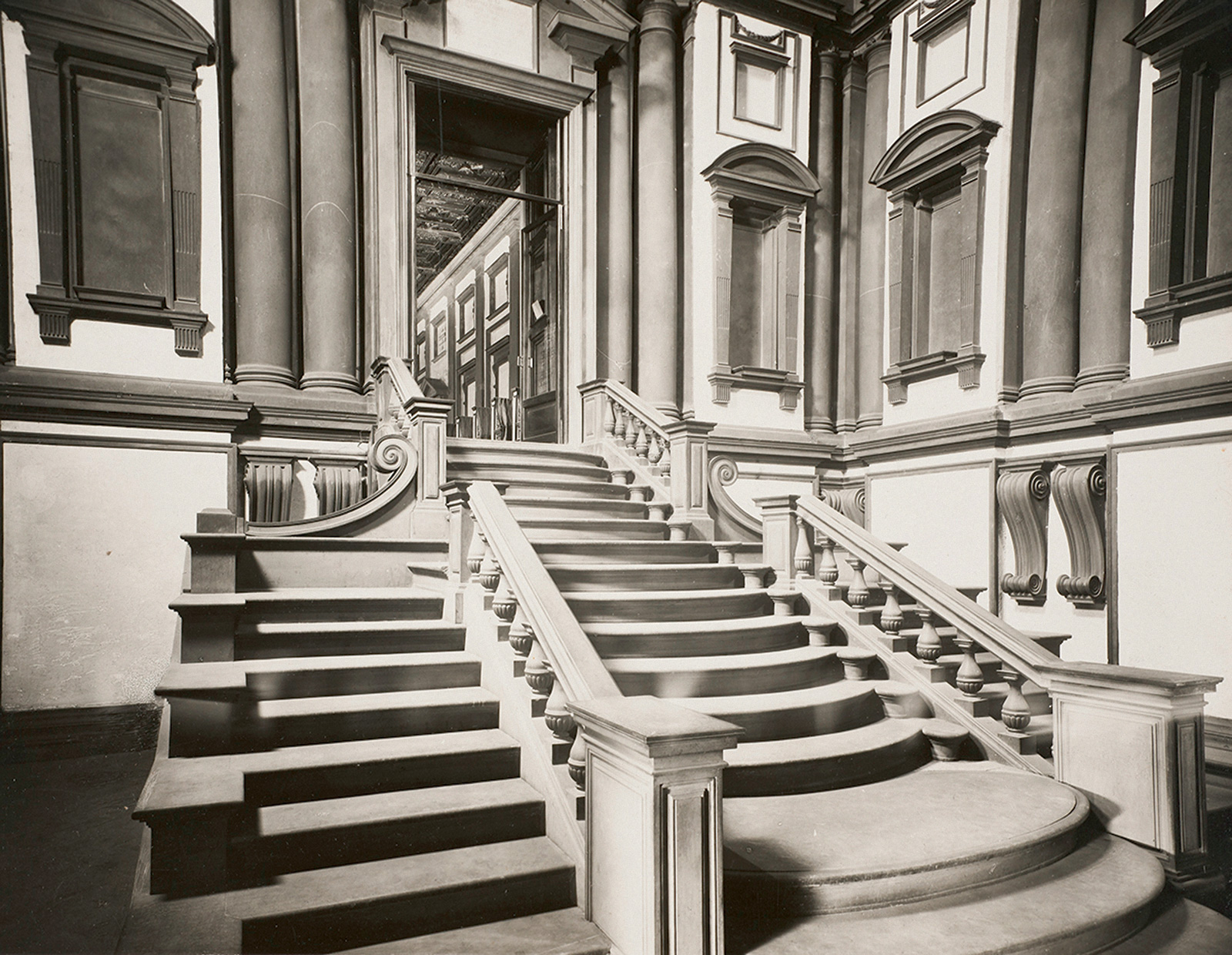
Thinking of this connection now, Rothko’s reference to Michelangelo’s Laurentian Library has never made more sense to me. The sense of claustrophobia and non-human feeling in Michelangelo’s closed quarters, sealed windows, and oversized theatrical staircase overflowing the modest space achieved, according to Rothko, “just the kind of feeling I’m after—he makes the viewers feel that they are trapped in a room where all the doors and windows are bricked up, so that all they can do is butt their heads forever against the wall.”
Having said that, on the album’s cover, there is also a kind of cosmic connection, as if we were looking at an astronomical observatory; there is something light-hearted in the starry night we could imagine through the skylight. Perhaps that’s what the wandering tourists questing for the spiritual revere at this secular-religious space. But he would have said again, “The dark is always at the top.”
If one last image were needed, it might be Dust Breeding (1920), Marcel Duchamp and Man Ray’s photographic recollection of the dust that had accumulated on The Large Glass over a one-year period, most certainly the epitome of the inframince (infra-thin). The transcendental and the banal again, zigzagging like dust in Brownian motion to produce a ghost landscape over the stripped, bare bride.
Or, why not, a vinyl record leaving the impression of a dust rainbow on Feldman’s album cover as it slowly works its way out from the inside. Purely suspended or eternally falling, dust endlessly falls “faintly through the universe and faintly falling, like the descent of their last end, upon all the living and the ....”
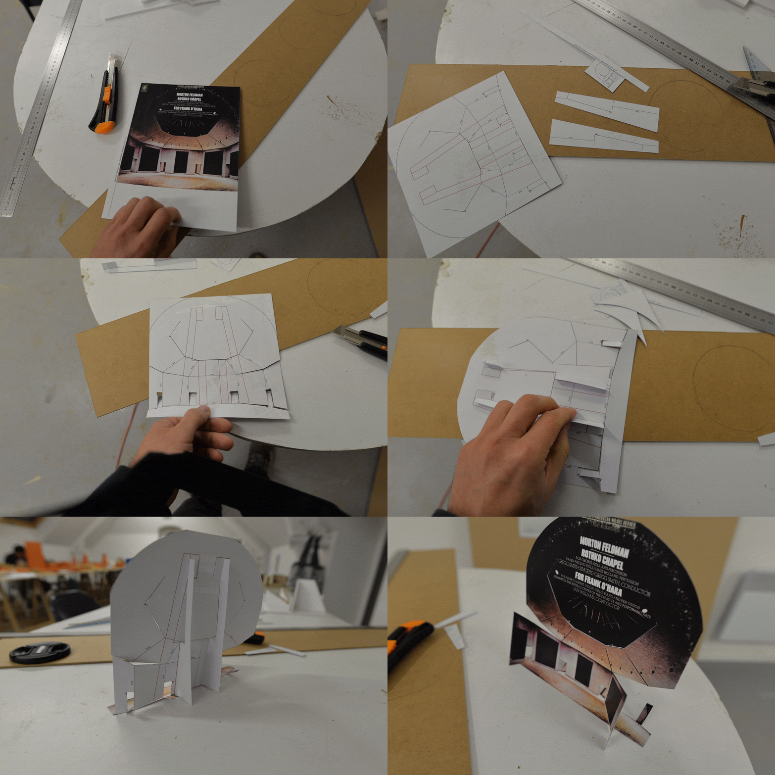
To make the paper sculpture included as part of this artist project, download this pdf and print it double-sided on the thickest paper that you can get through your (preferably color) printer. Then fetch some scissors and follow the instructions on the back. If you need additional pointers, below are photographs of Borja himself making the paper sculpture.

Santiago Borja is an artist based in Mexico City. He received his MFA from the Université Paris 8. He has exhibited at the Freud Museum in London (2010) and the Villa Savoye in Poissy (2011). In 2015, he will be exhibiting at the Mies van der Rohe Pavilion in Barcelona and taking part in the Chicago Architecture Biennial.
Spotted an error? Email us at corrections at cabinetmagazine dot org.
If you’ve enjoyed the free articles that we offer on our site, please consider subscribing to our nonprofit magazine. You get twelve online issues and unlimited access to all our archives.