Of Primitives and Primaries
Putting color in the classroom
Nicholas Gaskill
Art education in the United States began as a colorless affair. Walter Smith, the spokesperson for the industrial drawing campaign that first put art instruction on the public school curriculum in the 1870s, advised teachers to avoid color work until high school, and even then to use it only sparingly.[1] Color, he reasoned, was ancillary both to industrial drawing’s practical aims—its attempt to improve the quality of domestic goods by training the hands and eyes of future laborers—and to its metaphysical commitment to “form” as the “language of nature,” as opposed to the mere “transient circumstance” of color.[2] Yet by the 1890s, these grayscale lessons had given way to activities incorporating colored chalk, watercolors, bright parquetry blocks, crayons, and other colorful materials made newly available by advances in dying and color printing techniques. Far from being put off until high school, such chromatic exercises were now recommended particularly for young children, and were accompanied by dozens of books and articles advocating a range of competing approaches to color instruction. Everyone believed that color deserved a prominent place in the modern curriculum, but there was profound disagreement over which colors should be taught, and why.
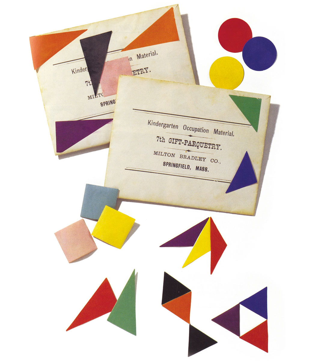
The three most prominent color instruction systems at the turn of the century—those of game designer Milton Bradley, chromolithographer Louis Prang, and painter-turned-color-theorist Albert Munsell—offered divergent programs for training the vision of the next generation, rooted in conflicting beliefs about both color and childhood. They nonetheless shared a common goal that distinguishes them from the direction color education took after the 1920s. Using exercises in both looking and making, these pedagogues sought to enhance a distinct faculty of color perception known as the “color sense.” And they claimed that this training, in turn, would give students the cognitive and social abilities befitting modern citizens, even as they disagreed about what these abilities were. More than a synonym for color perception, the color sense denoted a cultivated talent for seeing and feeling colors, both singly and in combination. It was thought to be trainable, possibly historical, and to vary across human populations.[3] Because it was a psychological rather than a physiological faculty—located in the mind more than the eye—the work of training the color sense involved providing students with a clear “mental image” of color. Such a mental image, educators argued, would set color instruction on a “solid” or “objective” or “logical” foundation (the terms varied only slightly) and the practical work of installing it in the child’s mind required that educators first agree on a set of color standards. What these standards were and how to derive them were the questions that most divided Bradley, Prang, and Munsell. The answers they generated reveal the historical concerns that brought color into the classroom and, in the process, made color perception a matter of pedagogical—at times even national—interest.