Colors / International Orange
Painting the civilian future
Adam Jasper
“Colors” is a column in which a writer responds to a specific color assigned by the editors of Cabinet.
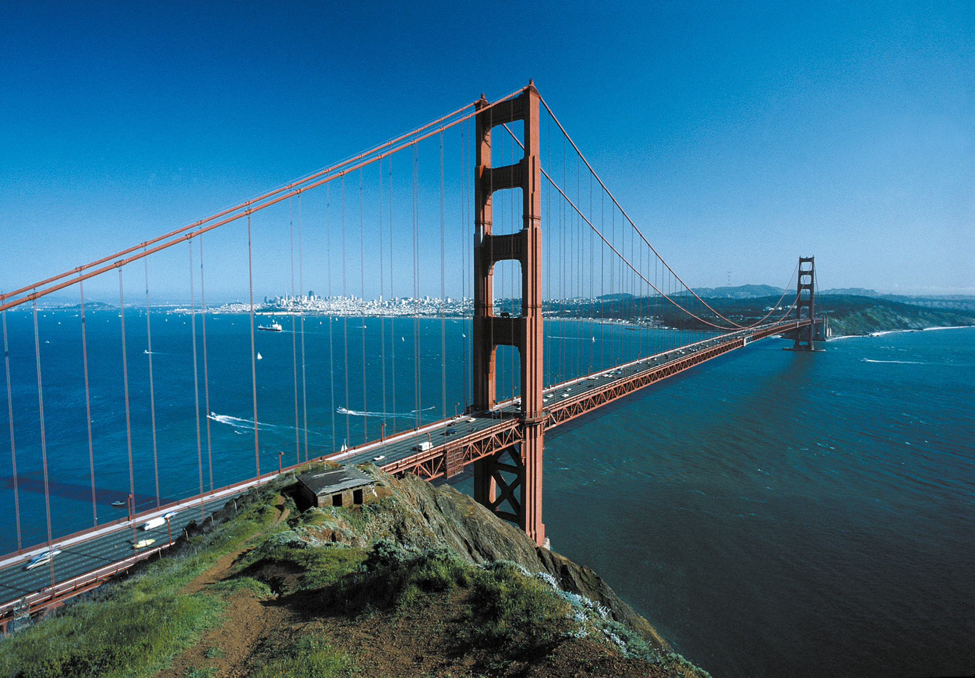
The most famous of all objects to be cloaked in this international airways orange is the Golden Gate Bridge, metonym for San Francisco and at the time of completion the longest suspension bridge in the world. Commuting by ferry to work each day to observe the bridge under construction, chief architect Irving Morrow was struck by the warm tone of the lead primer used to protect the steel members from corrosion. In his “Report on Color and Lighting” to the board of directors in 1935, he urged the use of such a color rather than the more prosaic gray or black. Morrow gave both pragmatic and aesthetic reasons for his proposal, but in the language of the report, it’s the aesthetic that predominates. A ruddy orange-red would reveal the subtle contours of the ironwork, and contrast against the sea and fog of San Francisco Bay. As Morrow wrote, “This color is luminous, undergoes atmospheric changes with great beauty, is prominent without insistence, [and] enhances the architectural scale to the utmost.” Painting the bridge gray, Morrow argued, would dull its impact, and would be tantamount to an attempt to hide it—a ludicrous notion when it came to the world’s largest bridge. Black, most objectionable of all, would reduce the towers to silhouettes and hide their art deco modeling. “A dead weight incompatible with grace,” black would compress the structure, making it simultaneously squat and loom. “Stubbornly inharmonious with the landscape,” it would never do. Armed with a clutch of allegedly spontaneous letters from San Francisco residents demanding a vibrant orange-red, Morrow beseeched the committee to listen to his expert opinion and accede to the voice of the people.[1] And so it was that the bridge was painted its legendary hue.
Oddly enough, however, the phrase “international orange” does not appear once in Morrow’s 1935 report. It is first used to describe the color of the bridge in 1937, the same year that it opened. And the custom touch-up paint now mixed by Sherwin-Williams under the name “Golden Gate Bridge International Orange” is not the same international orange used in aerospace and engineering, but rather a slightly darker, earthier color. It seems on the face of it that the name is either a retrospective branding exercise by the bridge builders, a choice phrase to transfer some of the futuristic qualities of aviation to the bridge itself, or—more likely—that the bridge gradually changed color, as the original lead pigments darkened under the California sun, and the recipe for the paint had to be incrementally darkened in order to keep up.[2]